From a sword to a leading light
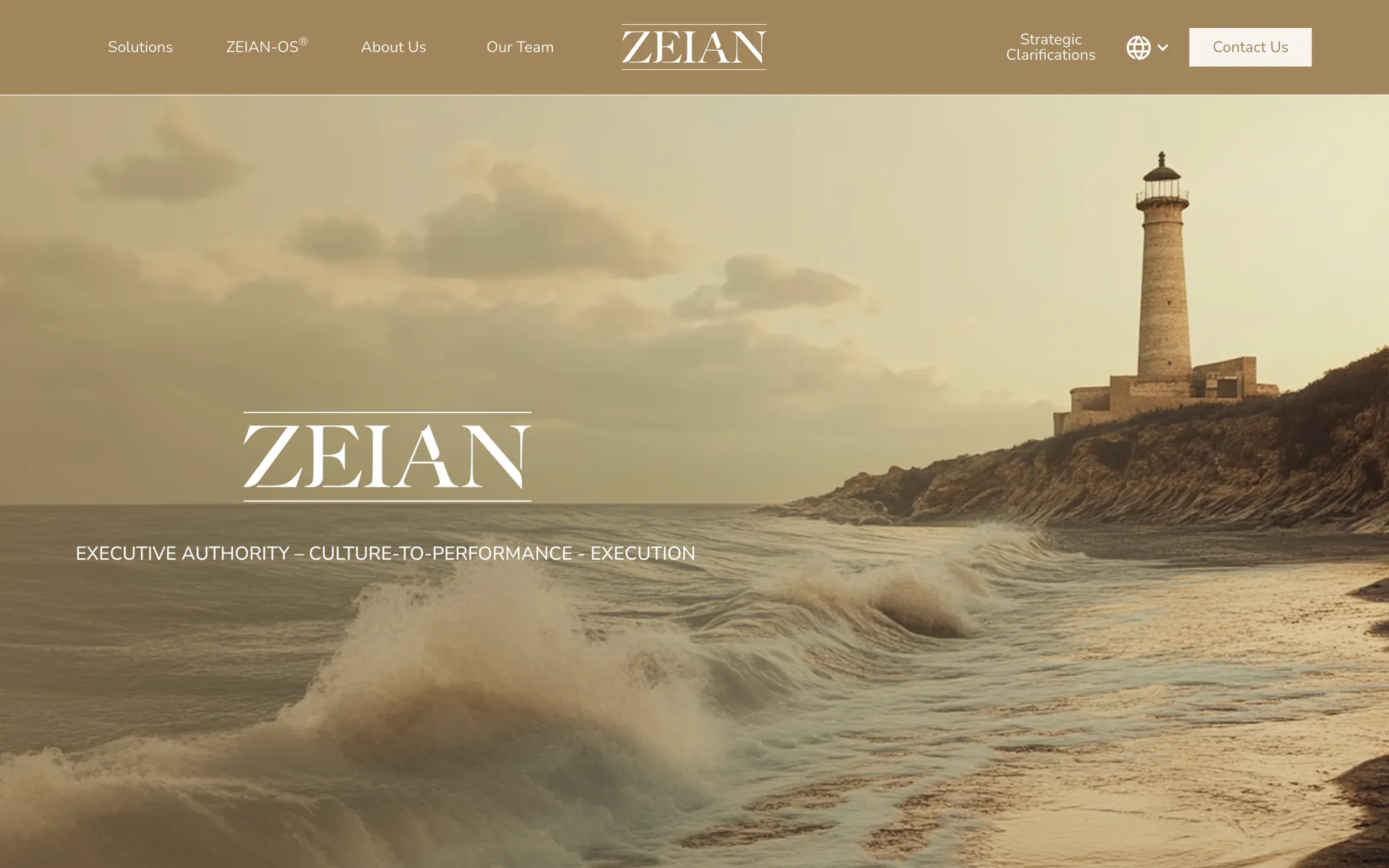
Zeian helps leaders build regenerative company cultures, but its old brand looked ready for a fight. I rebuilt it around guidance and light, then carried it into the one-pager and the website.
2x
larger deal size
in proposals after the rebrand
2
logo proposals
one chosen with no extra rounds
6
weeks
from discovery to launch
01
The client
Zeian Group is a leadership consultancy that helps executive teams build regenerative cultures. Its own purpose statement says it best: "Zeian exists to help leaders and organisations upcycle and build thriving regenerative organisational cultures." The rebrand came through Effiqs in 2024.
02
The challenge
The 2023 brand fought against the work. A sword ran through a copper wordmark on black, built on a Ruler archetype with Pantheon imagery. It looked strong, but it read as combative, and Zeian sells trust, growth and cultures where people thrive. Executives who hire a regenerative consultancy aren't looking for a general. The new brand had to feel like guidance: calm and senior, without losing the weight to sit in a boardroom.
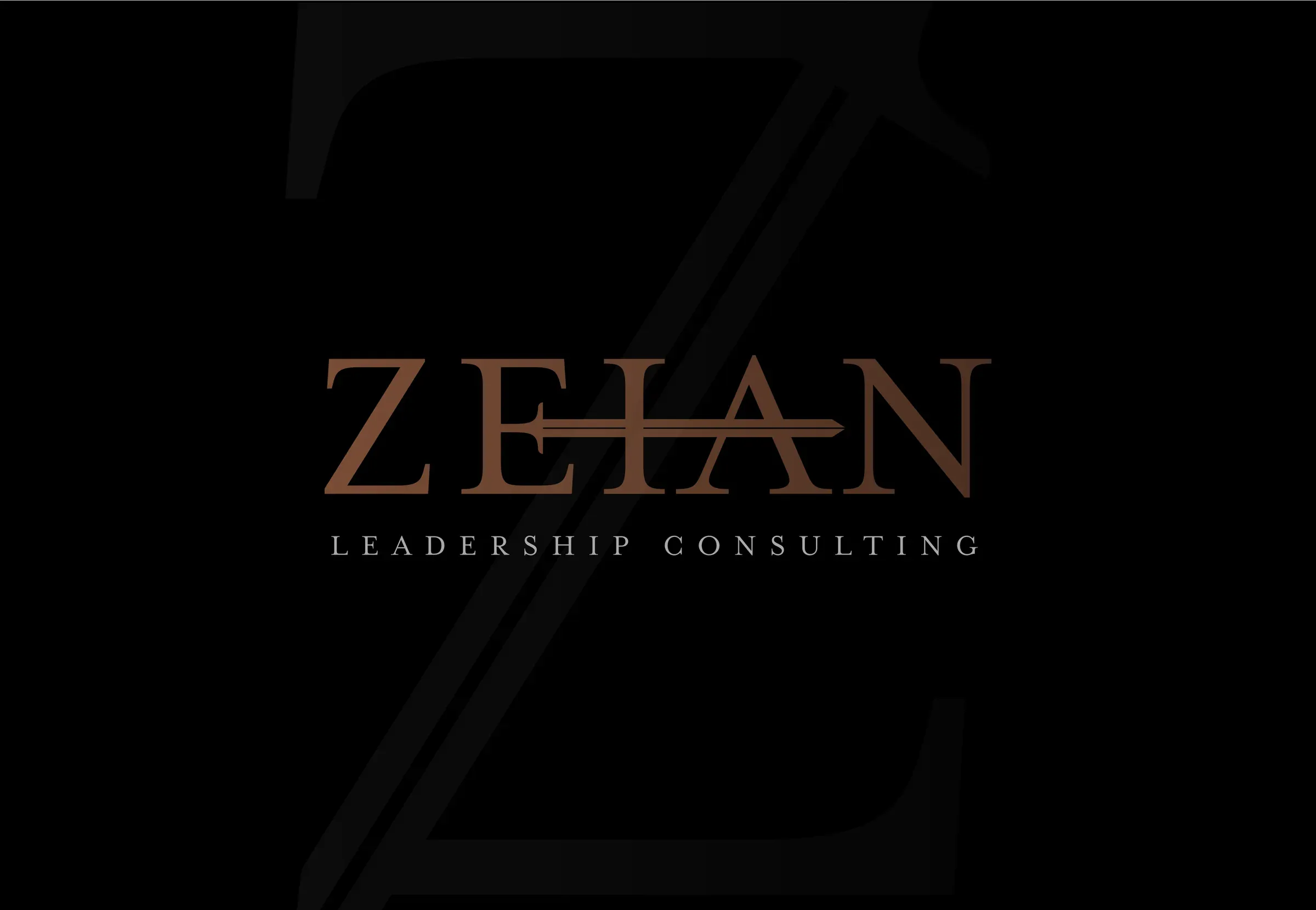
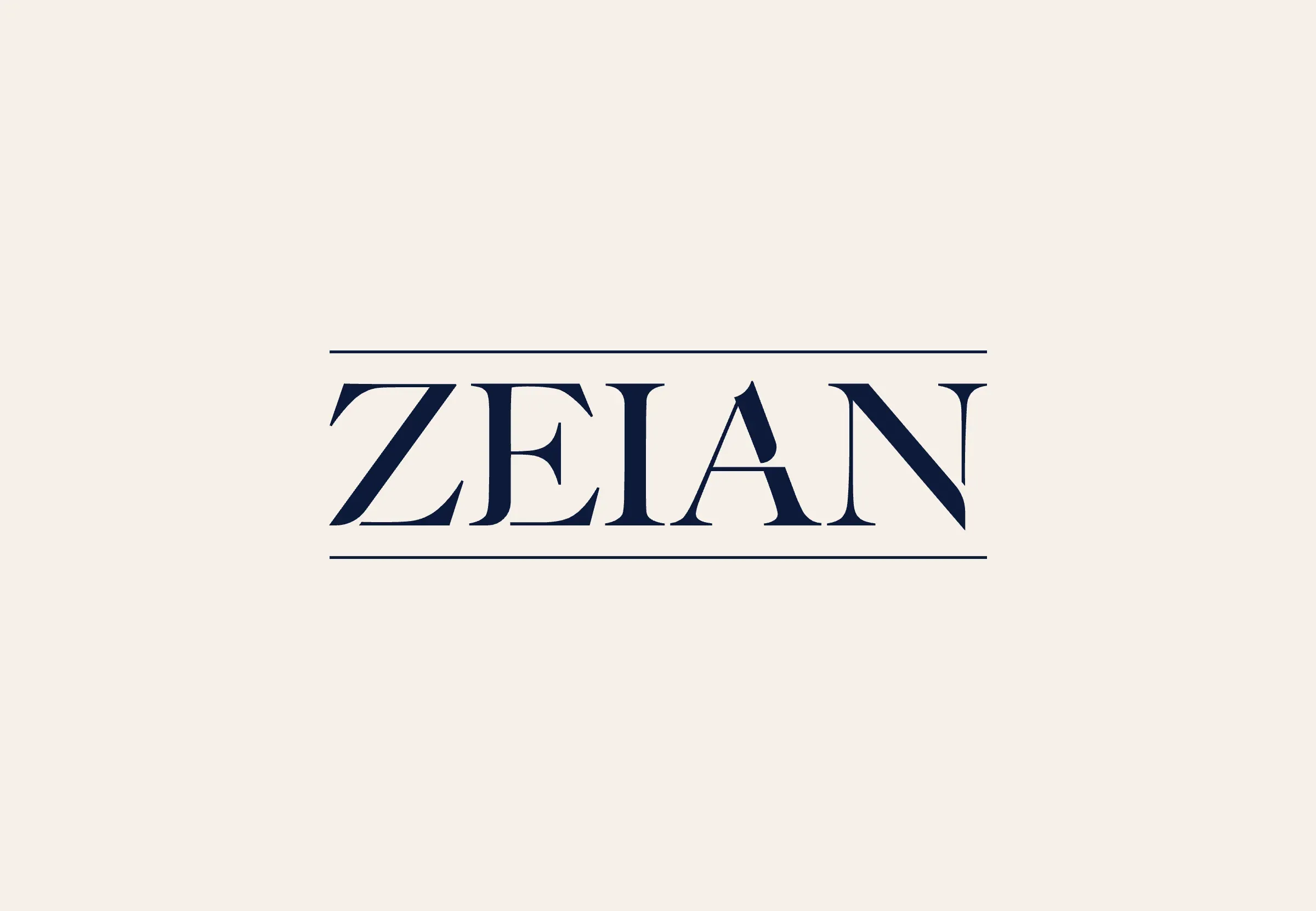
Drag to compare. Left: the 2023 sword wordmark, copper on black. Right: The Leading Light, sand and navy on cream.
03
The process
The problem was strategic before it was visual, so strategy came first.
- 01Discovery questionnaire. How the founders see Zeian, their clients and the market.
- 02Strategic document. Purpose, positioning and a new archetype pairing, signed off before design.
- 03Stylescape. The visual territory for "the leading light", tested before logo work.
- 04Logo presentation. Two proposals, shown in real applications.
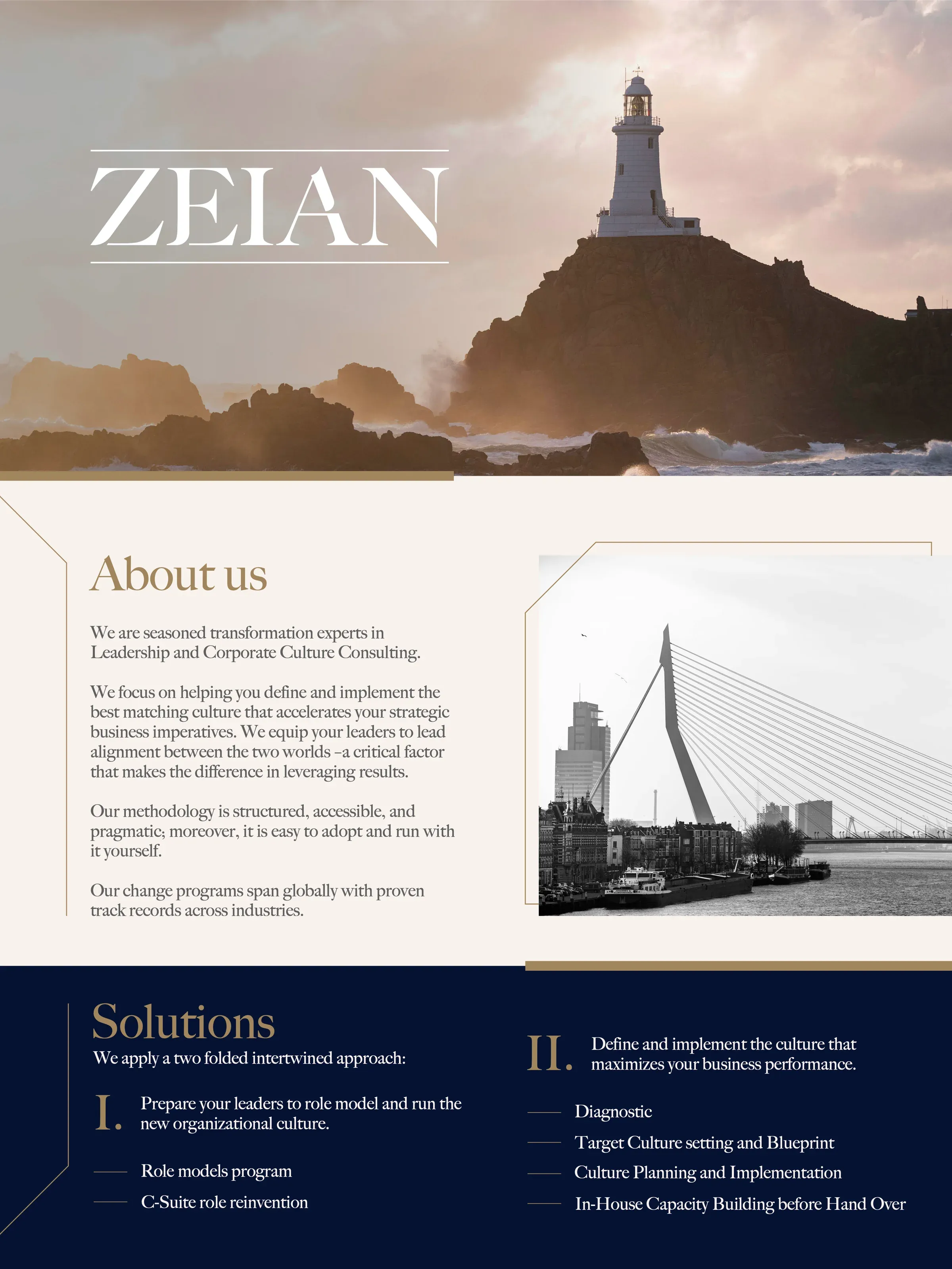
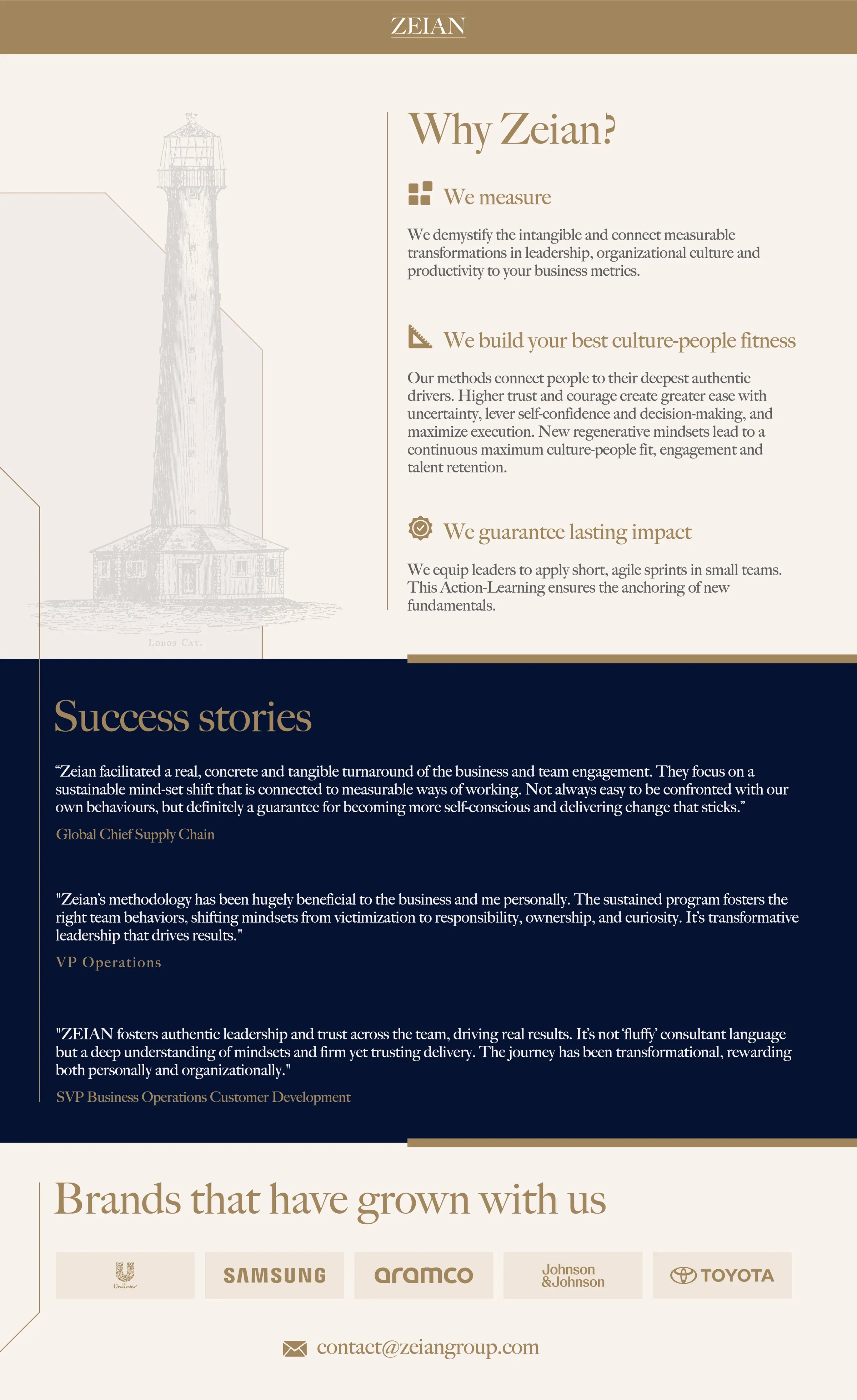
- 05Rollout. A 2025 one-pager and the website, designed and built.
01 / 03

Stylescape 2024
02 / 03
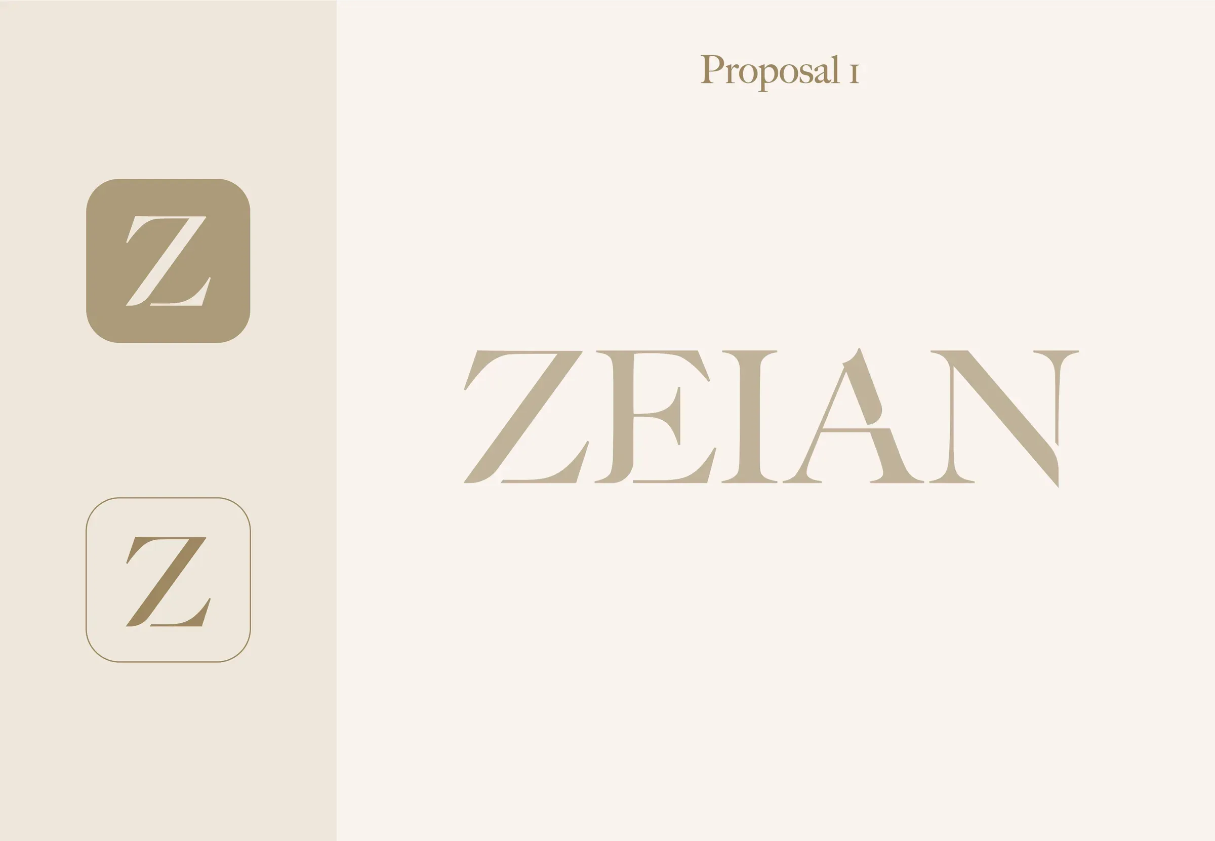
Proposal 1
03 / 03
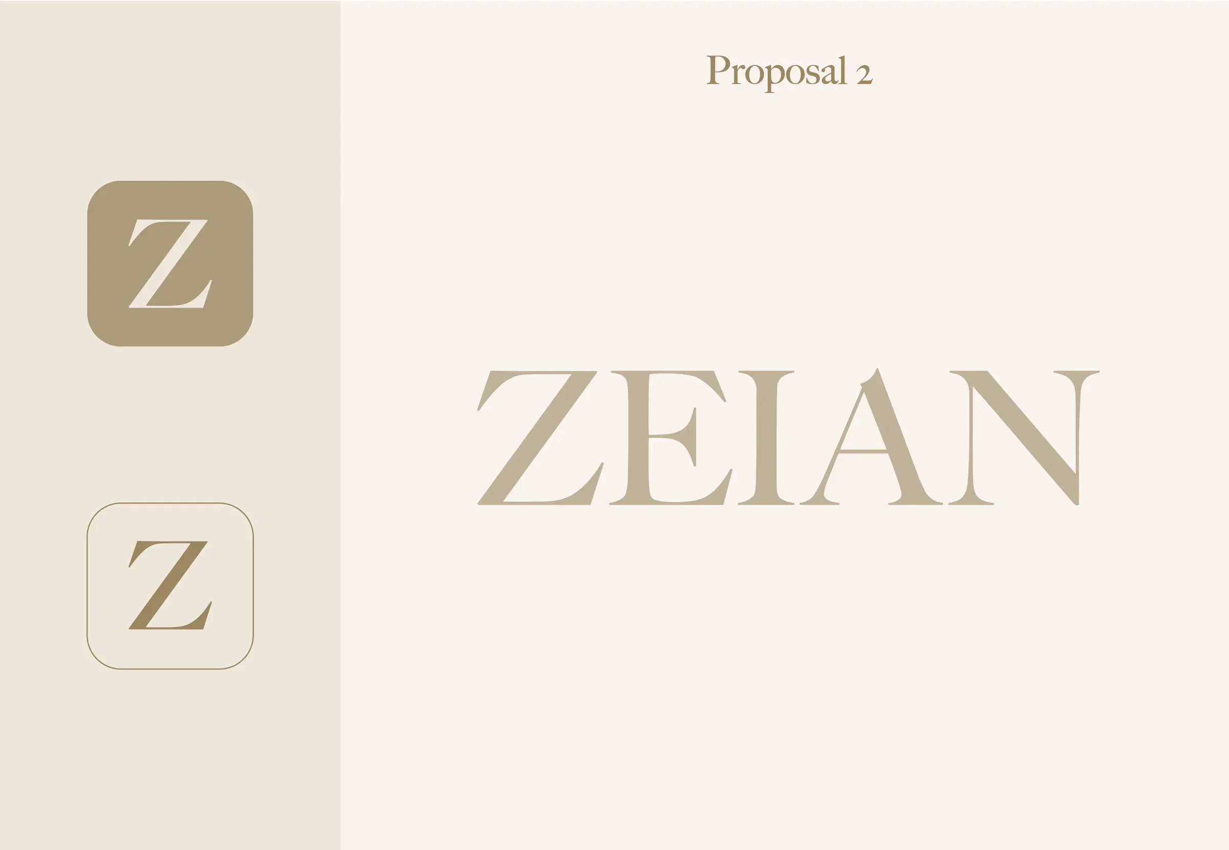
Proposal 2
04
The solution
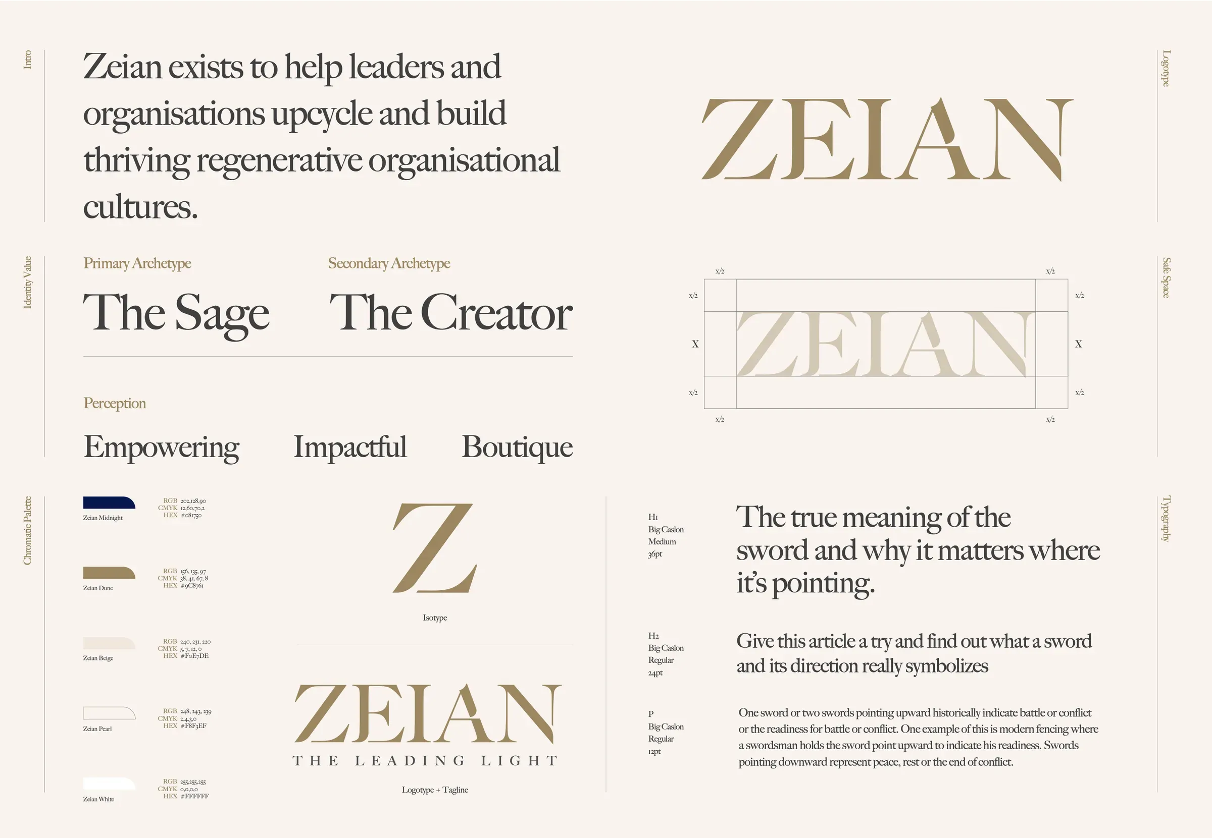
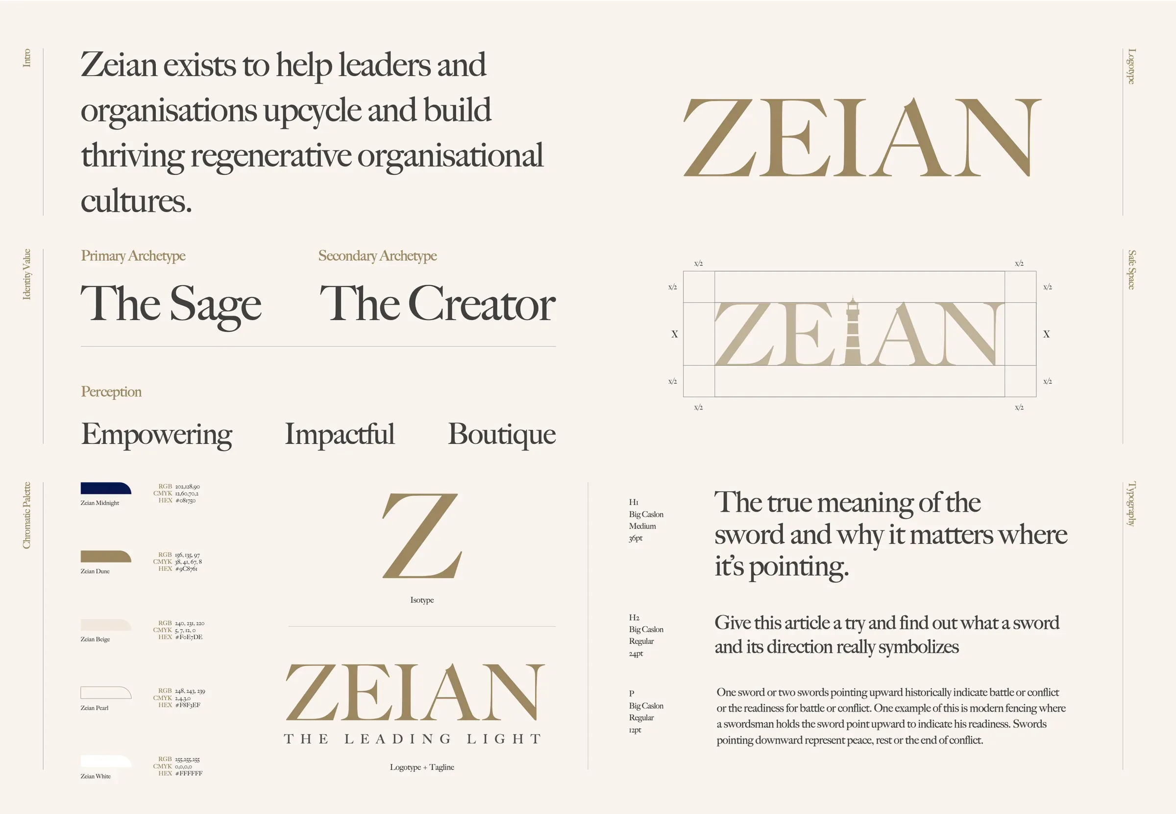
The concept is The Leading Light. A lighthouse doesn't command ships; it shows them the way home. That shift moved the brand from the Ruler to the Sage, with the Creator as a secondary archetype, and gave it three words to live up to: empowering, impactful, boutique.
The wordmark is a warm, light serif in sand (#B8A58A) on cream (#F6F0EA), with navy (#0E1A3A) as the secondary color for weight and contrast. A Z monogram works as an app tile and avatar. Imagery follows the idea literally: lighthouses and the Mediterranean coast, with cityscapes to keep it grounded in business. I then produced the one-pager and designed and built the website on the same system.
05
Results
Zeian now looks like what it sells. The brand invites a conversation instead of bracing for one, which is exactly the tone of a first meeting about culture.
The website went live exactly as presented, because the person who designed it also built it.
2x
larger deal size
in proposals after the rebrand