A rebrand that finally looked as sharp as the work behind it
Effiqs helps B2B tech companies grow, but its own brand was stuck years behind its clients. I rebuilt the identity from the ligature up and carried it through the website, campaigns and stationery.
3x
more inbound leads
in the 6 months after launch
5
logo rounds
from sketch to final mark
60+
custom icons
drawn on the same hex grid
42%
lower bounce rate
on the new website
01
The client
Effiqs is a remote growth consultancy for B2B tech companies in the US and Europe. It builds brands, websites and demand engines for SaaS teams. I ran its design and development practice for four years, which made this the one client I knew from the inside.
02
The challenge
The old brand said "agency from ten years ago." All-caps EFFIQS set on red blocks, a navy and orange site, 3D clay icons borrowed from a template library. Prospects were SaaS founders with sharp taste, and the first impression undercut every pitch we made. The new identity had to feel technical and precise without going cold, and it had to hold up across a website, ads and a sales deck from day one.
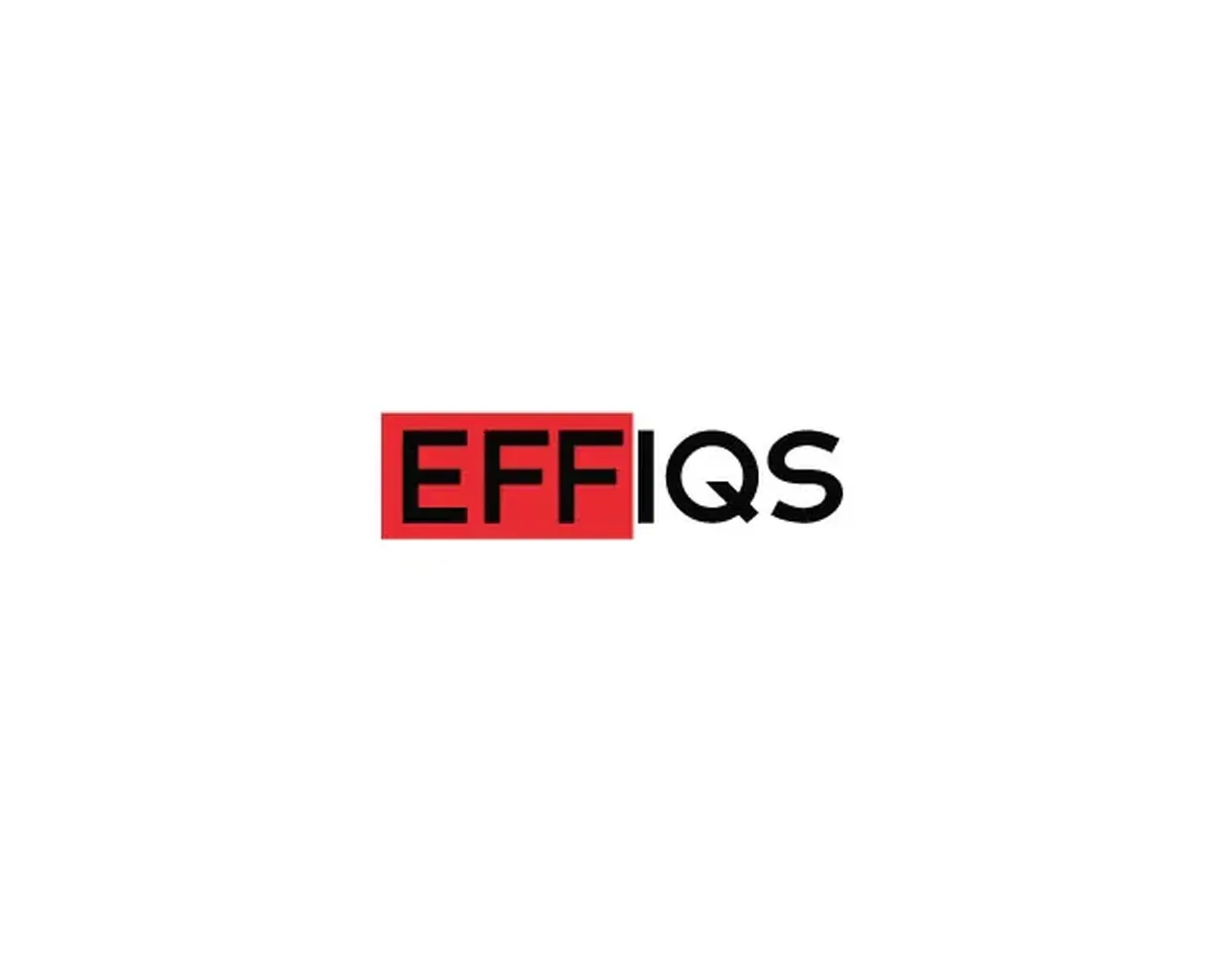
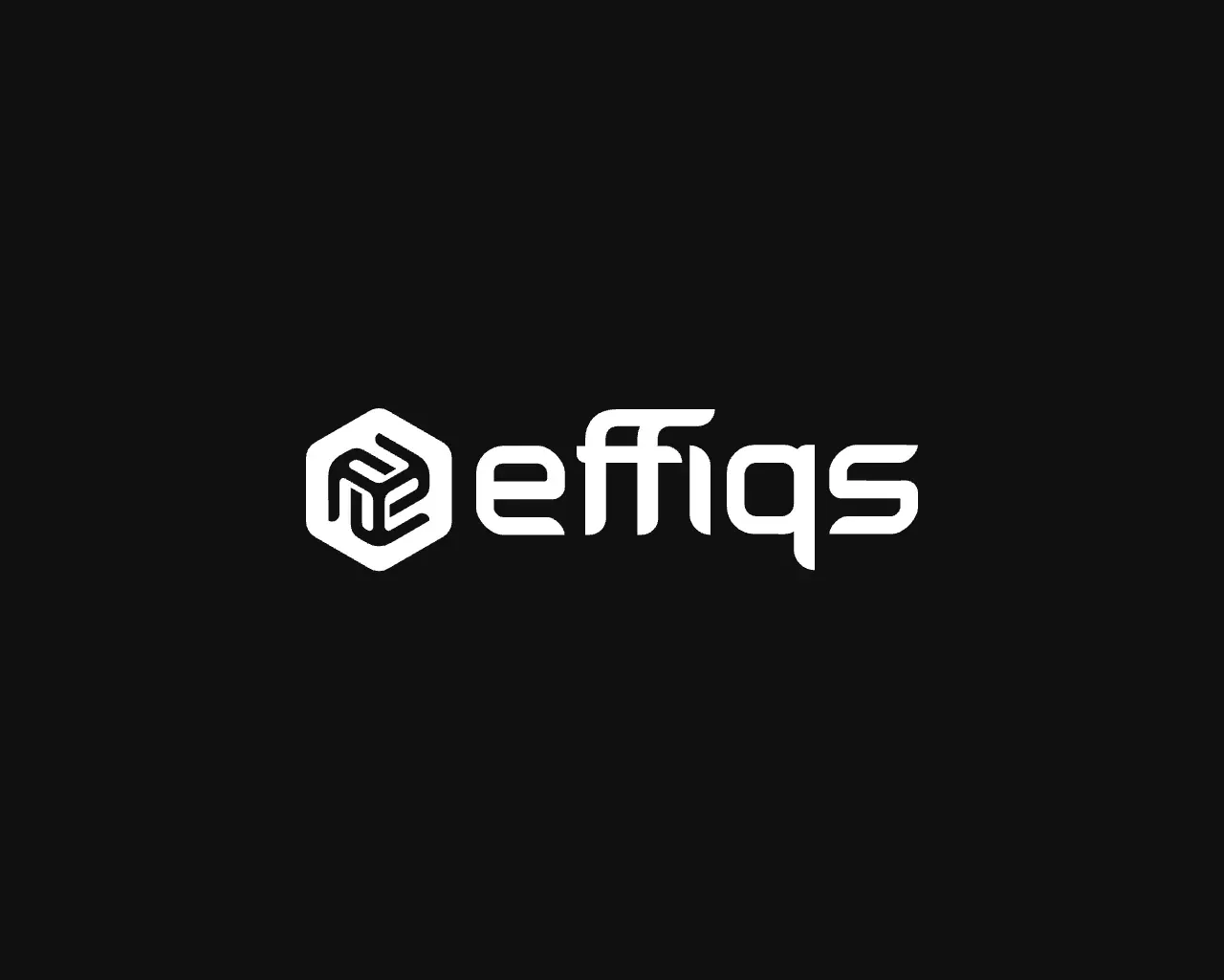
Drag to compare. Left: the all-caps wordmark and clay-icon site. Right: the lowercase ligature, the hex isotype and the green system on near-black.
03
The process
I treated our own brand like a client project, with a roadmap, a brief and sign-offs, so it wouldn't turn into an endless side quest.
- 01Roadmap. Scope, milestones and who decides what, agreed before anyone opened Figma.
- 02Exploration guidelines. Referents and a short list of what the brand should and shouldn't feel like.
- 03Sketches. Dozens of pencil routes for the wordmark and a possible symbol.
- 04Isometric construction. The isotype drawn on a hexagonal grid so every angle had a reason.
- 05Logo v1 to v5. Five rounds of refinement, then guidelines and rollout.
01 / 11
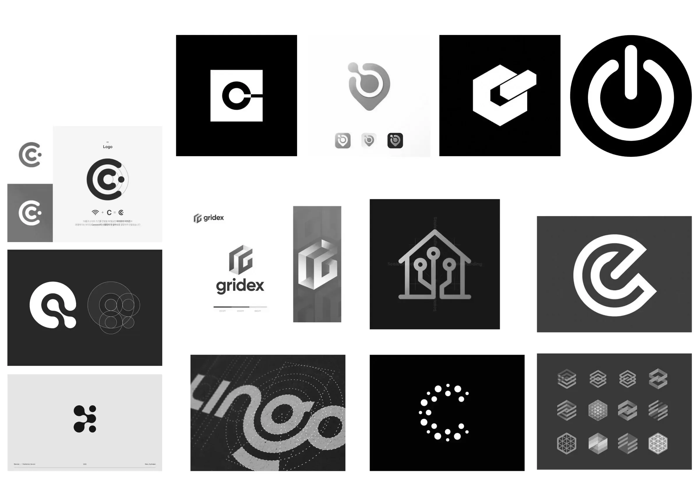
Referents
02 / 11
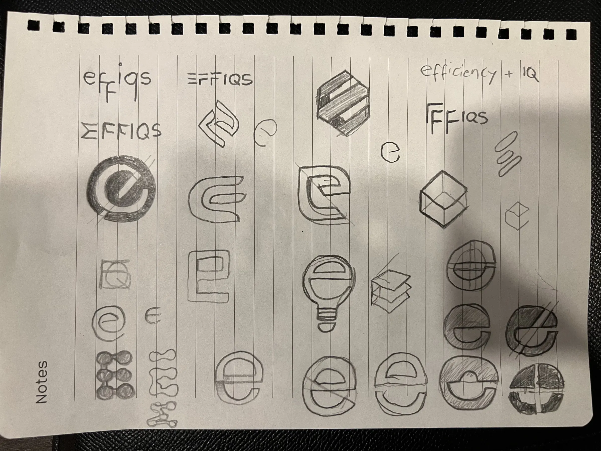
Sketch a
03 / 11
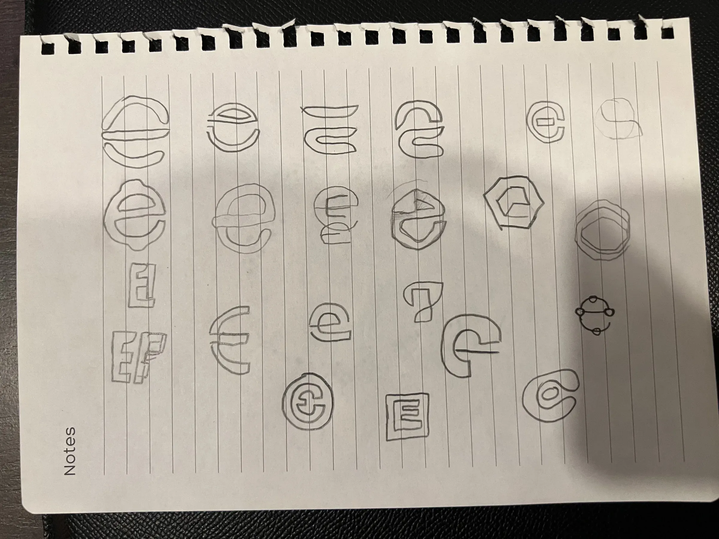
Sketch b
04 / 11

Isometric construction
05 / 11
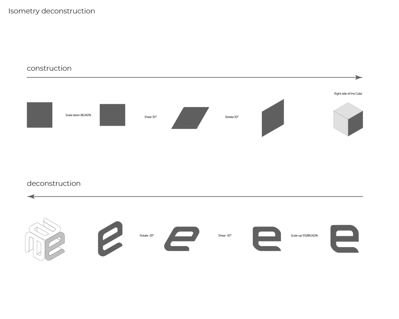
Construction deconstruction
06 / 11
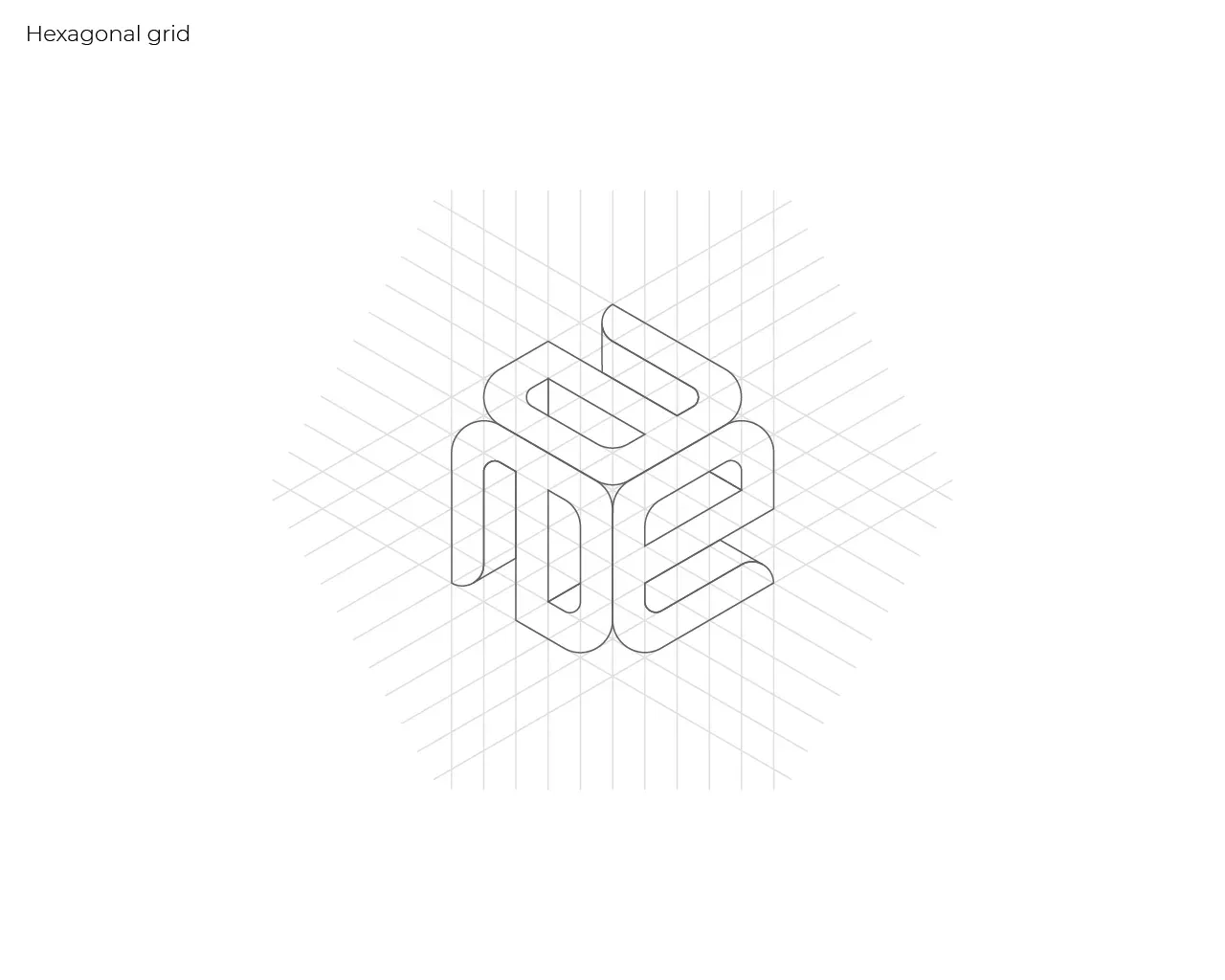
Hexagonal grid
07 / 11
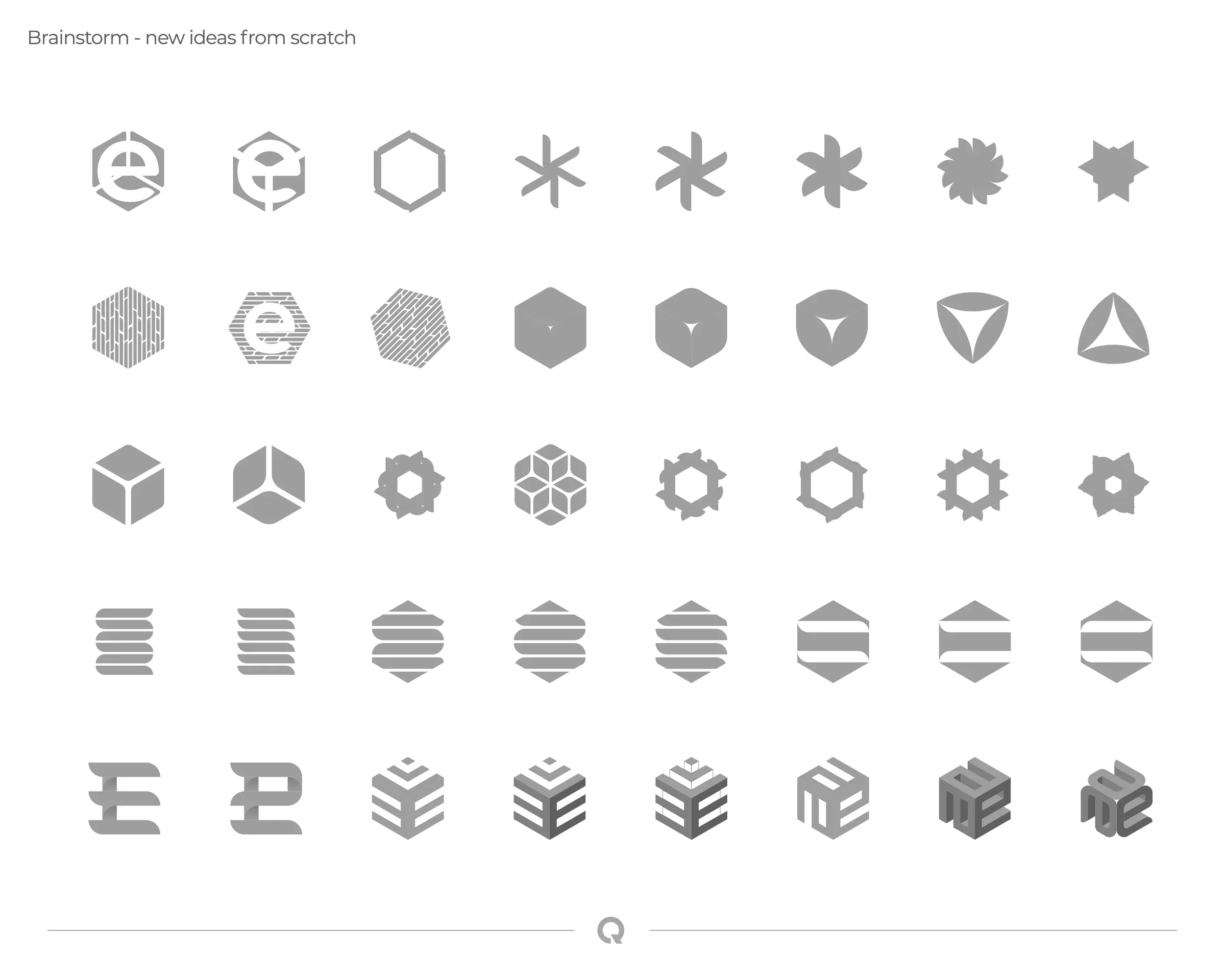
05b isotype exploration
08 / 11
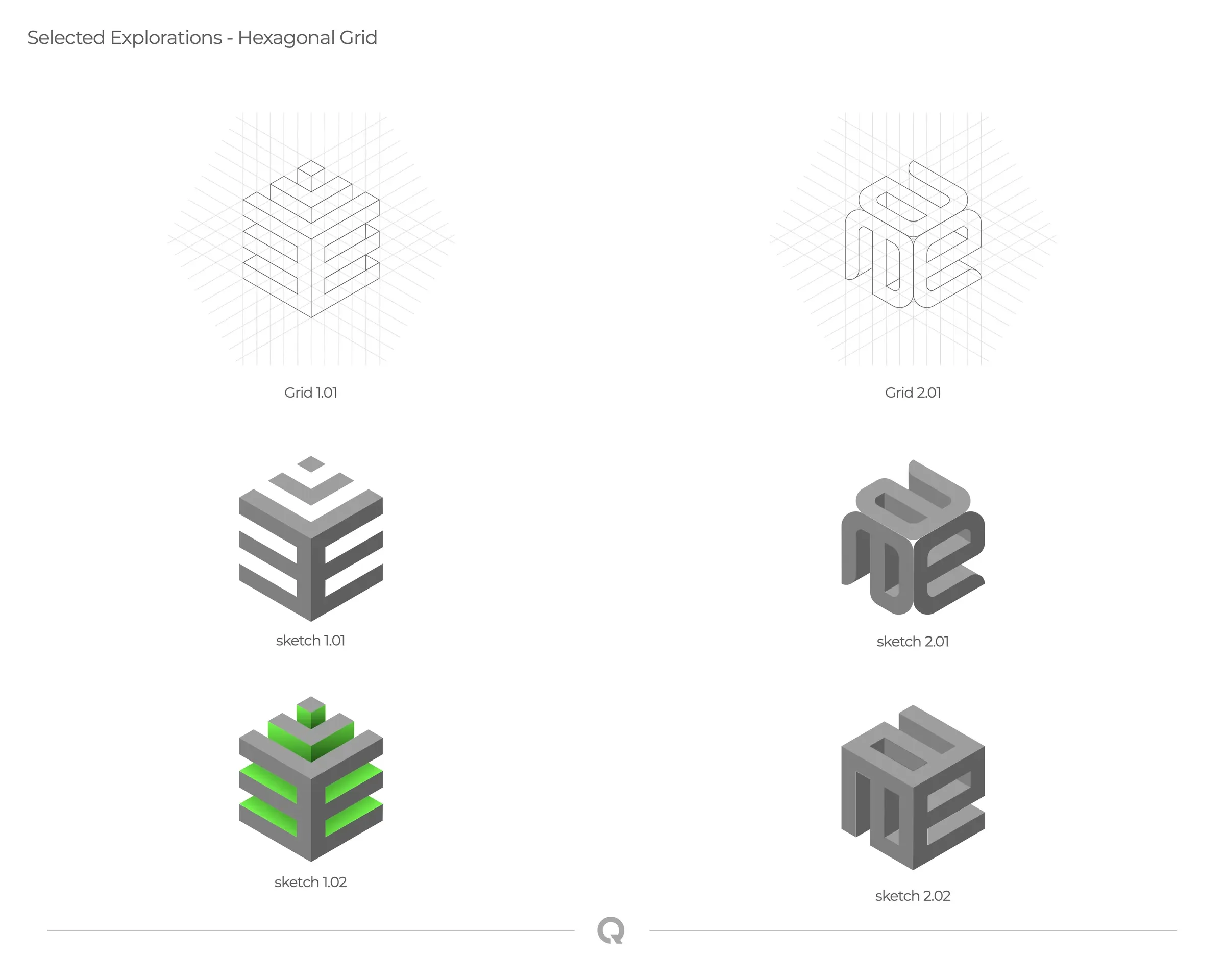
05c hex explorations
09 / 11
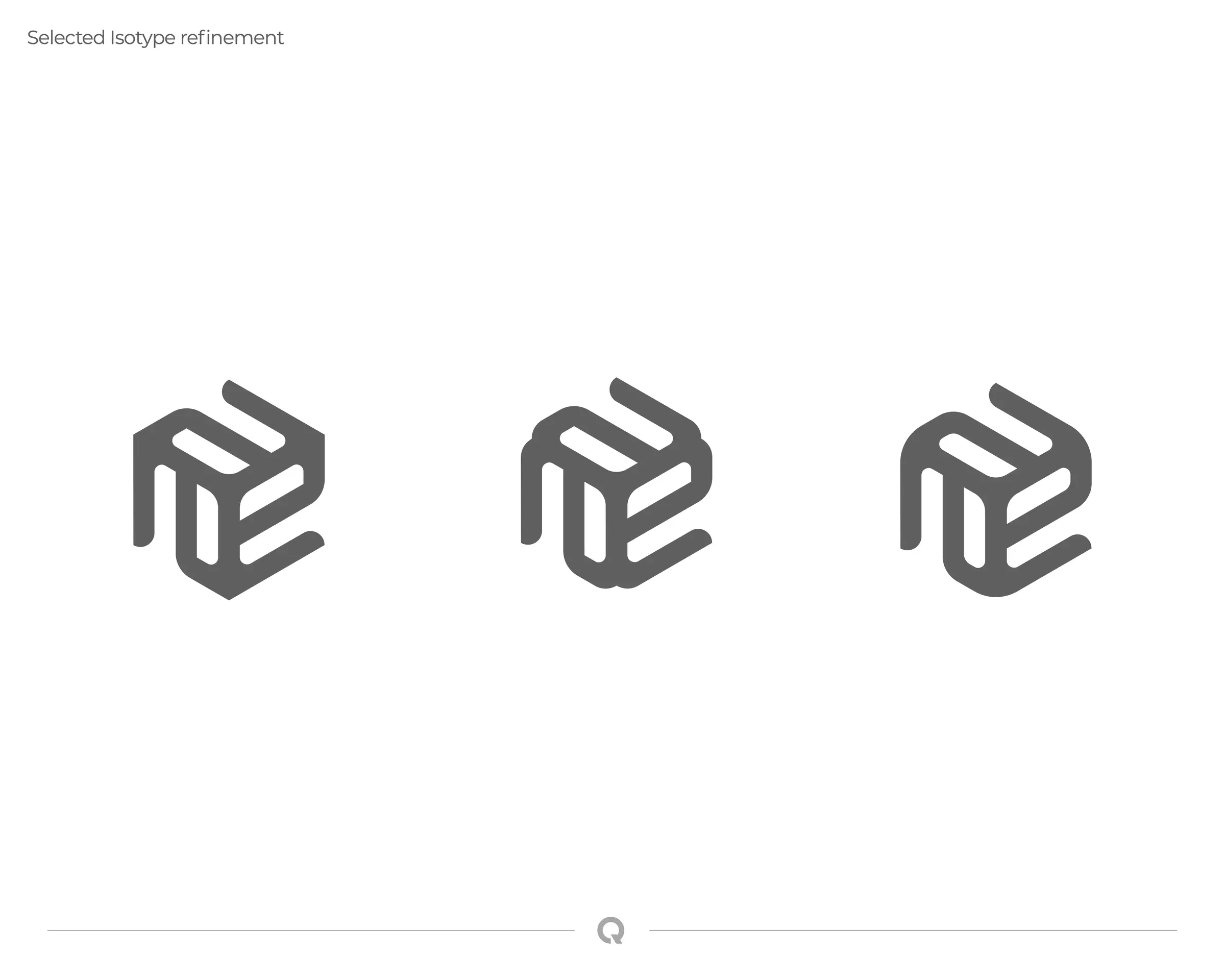
05d isotype refinement
10 / 11
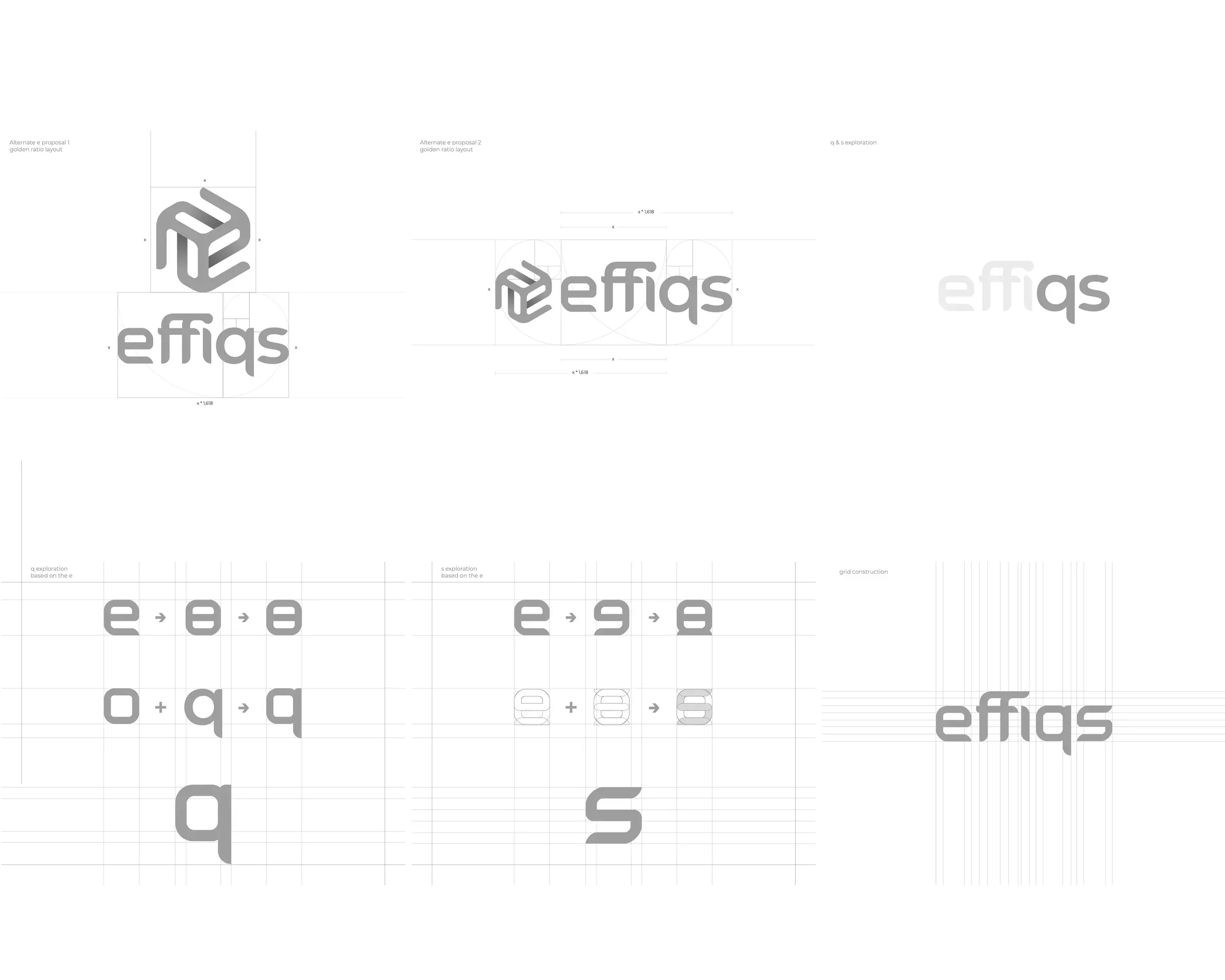
Wordmark construction
11 / 11
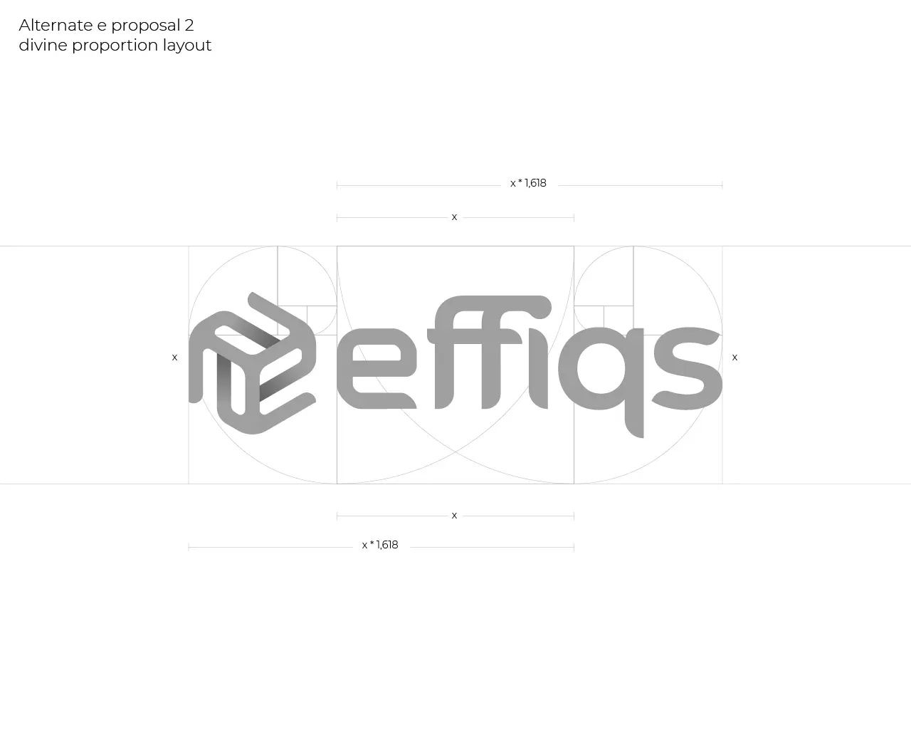
Proportion lockup
04
The solution
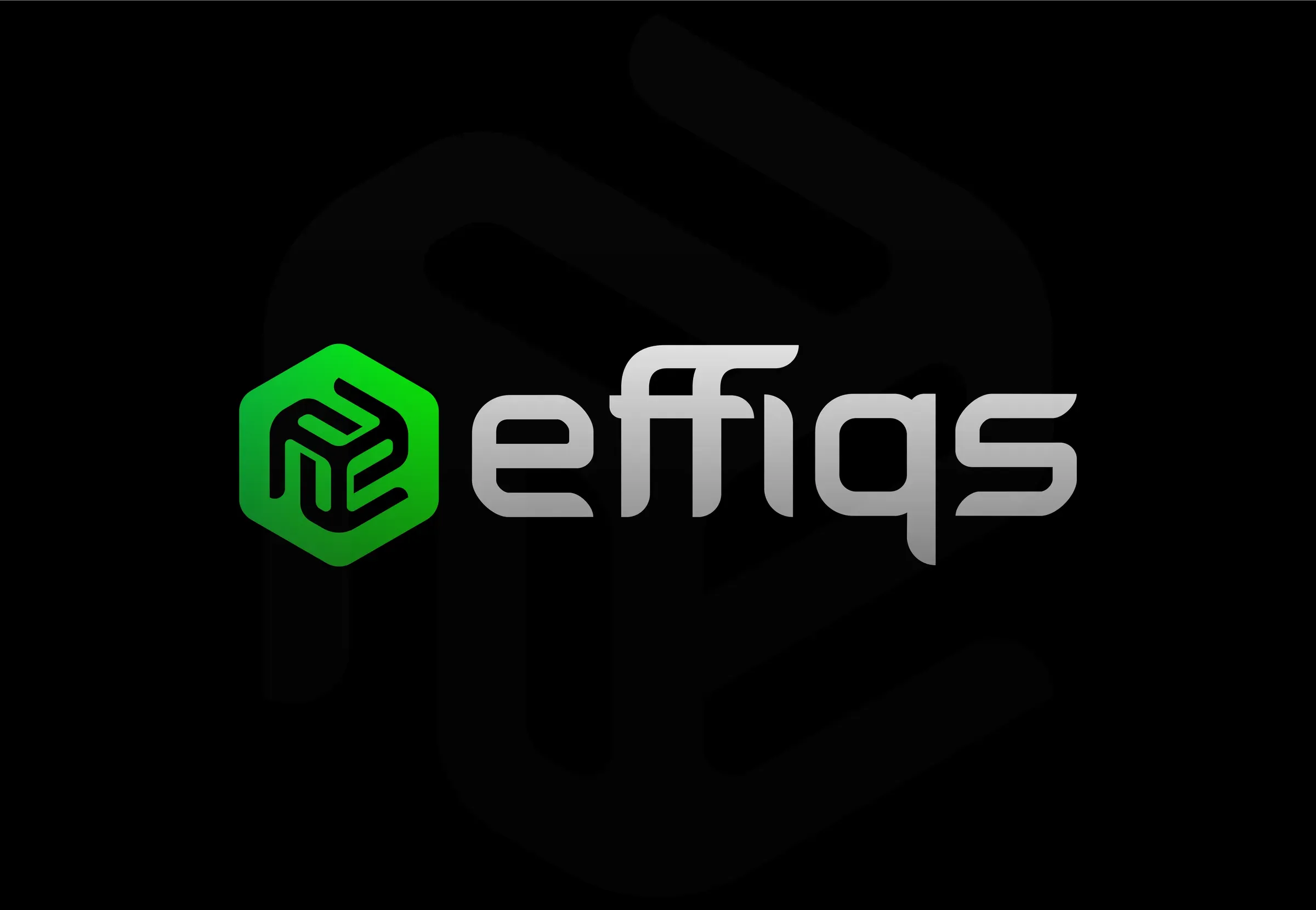
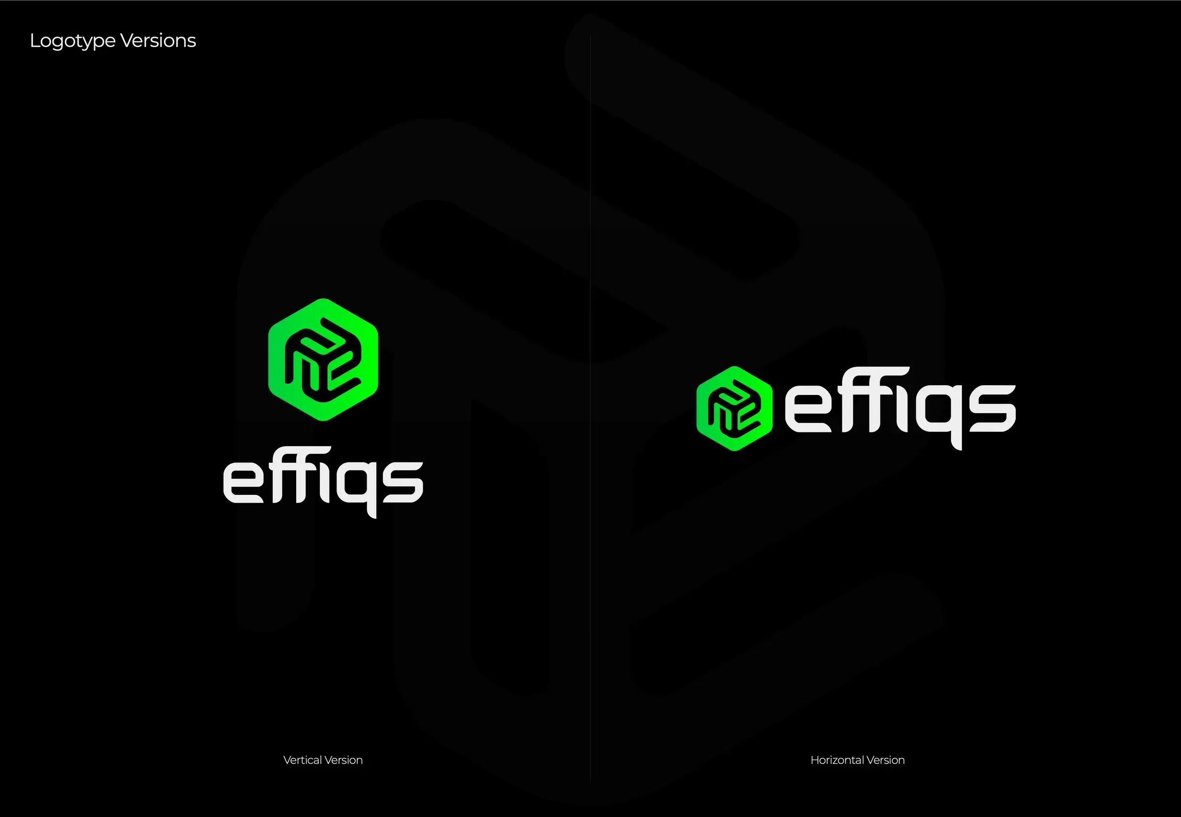
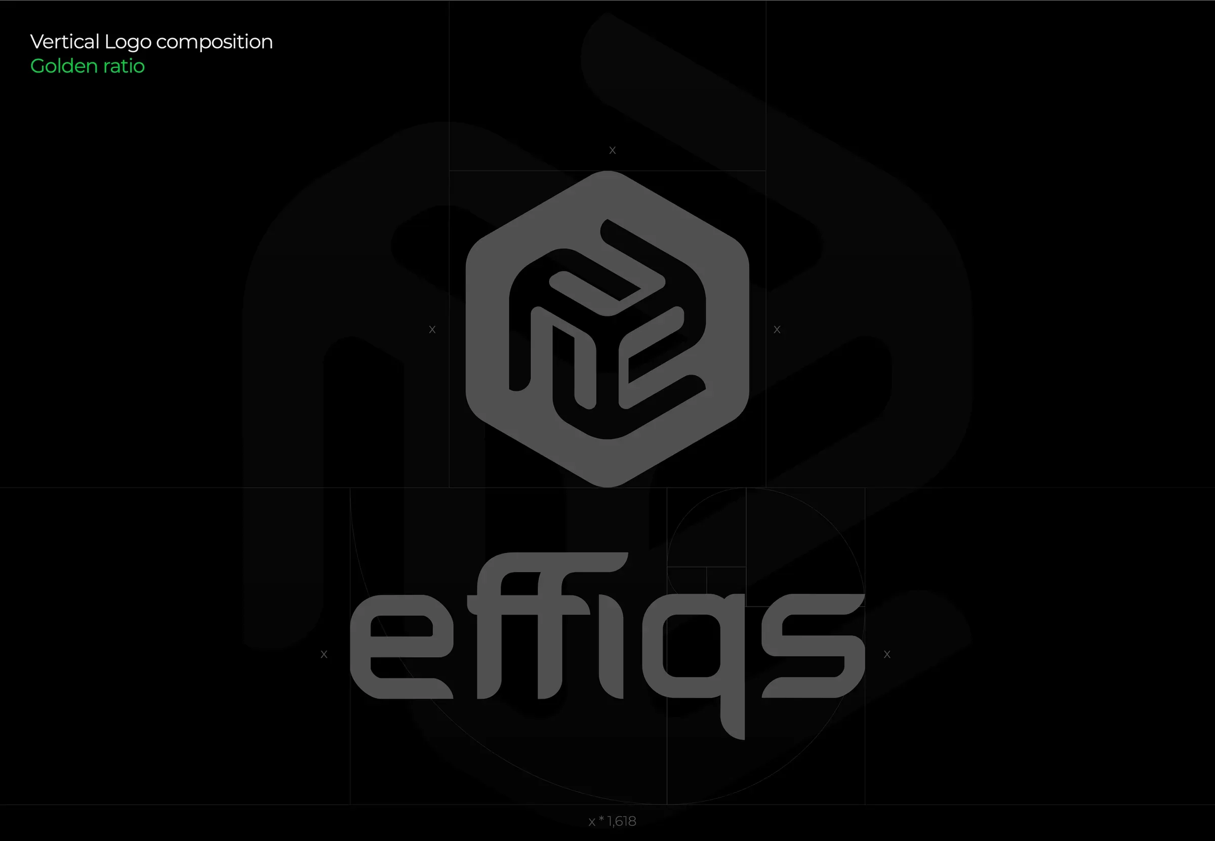
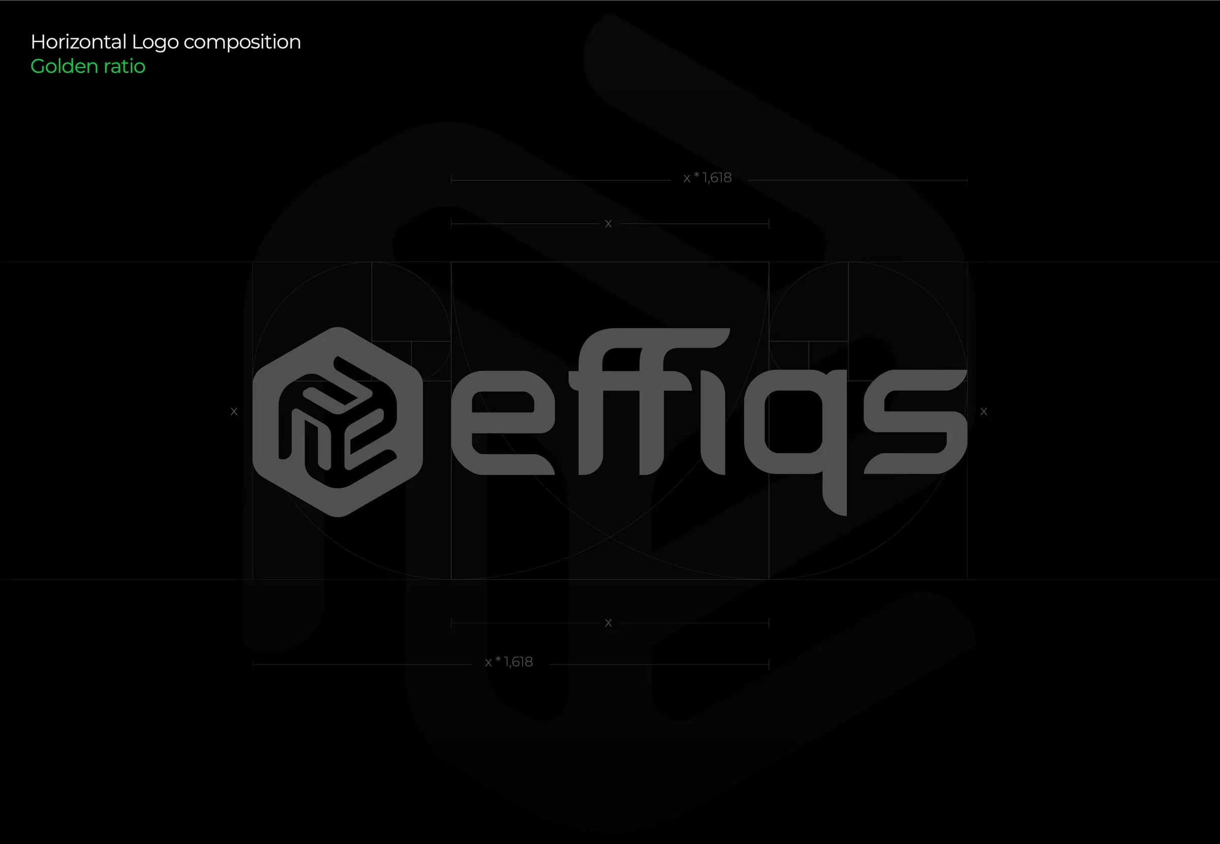
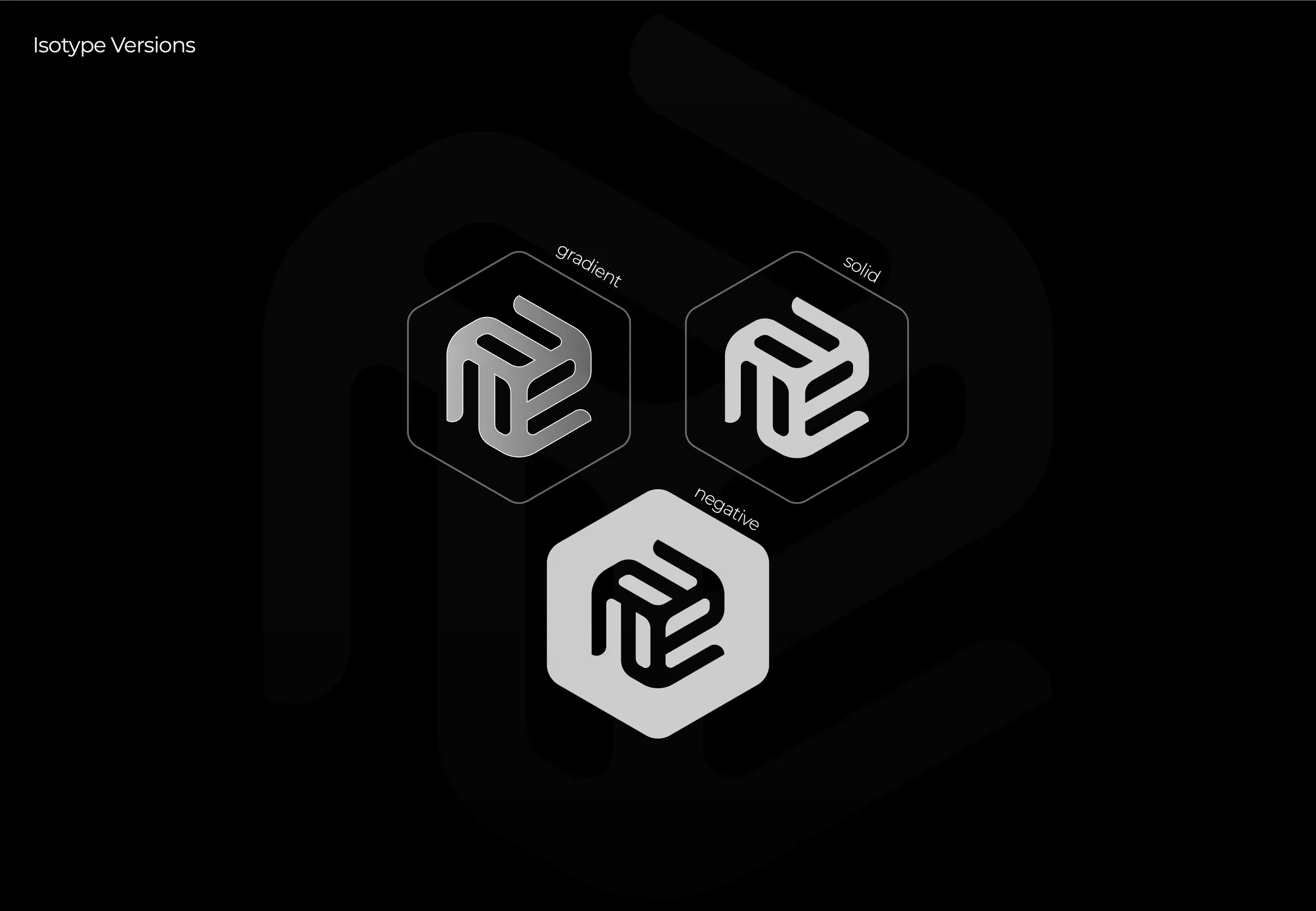
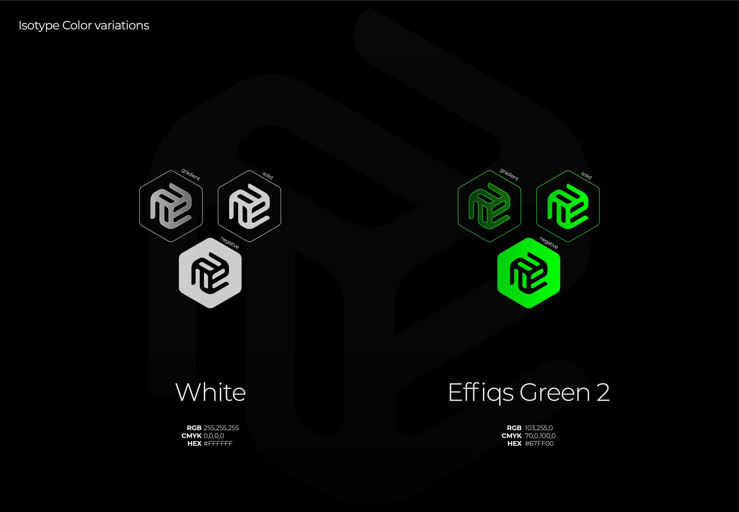
The wordmark went lowercase and got a custom ffi ligature, so the name reads as one fluid shape instead of six shouting letters. Next to it sits a hexagonal isotype built on an isometric grid: a small 3D block that suggests structure and building, which is literally what Effiqs does for its clients.
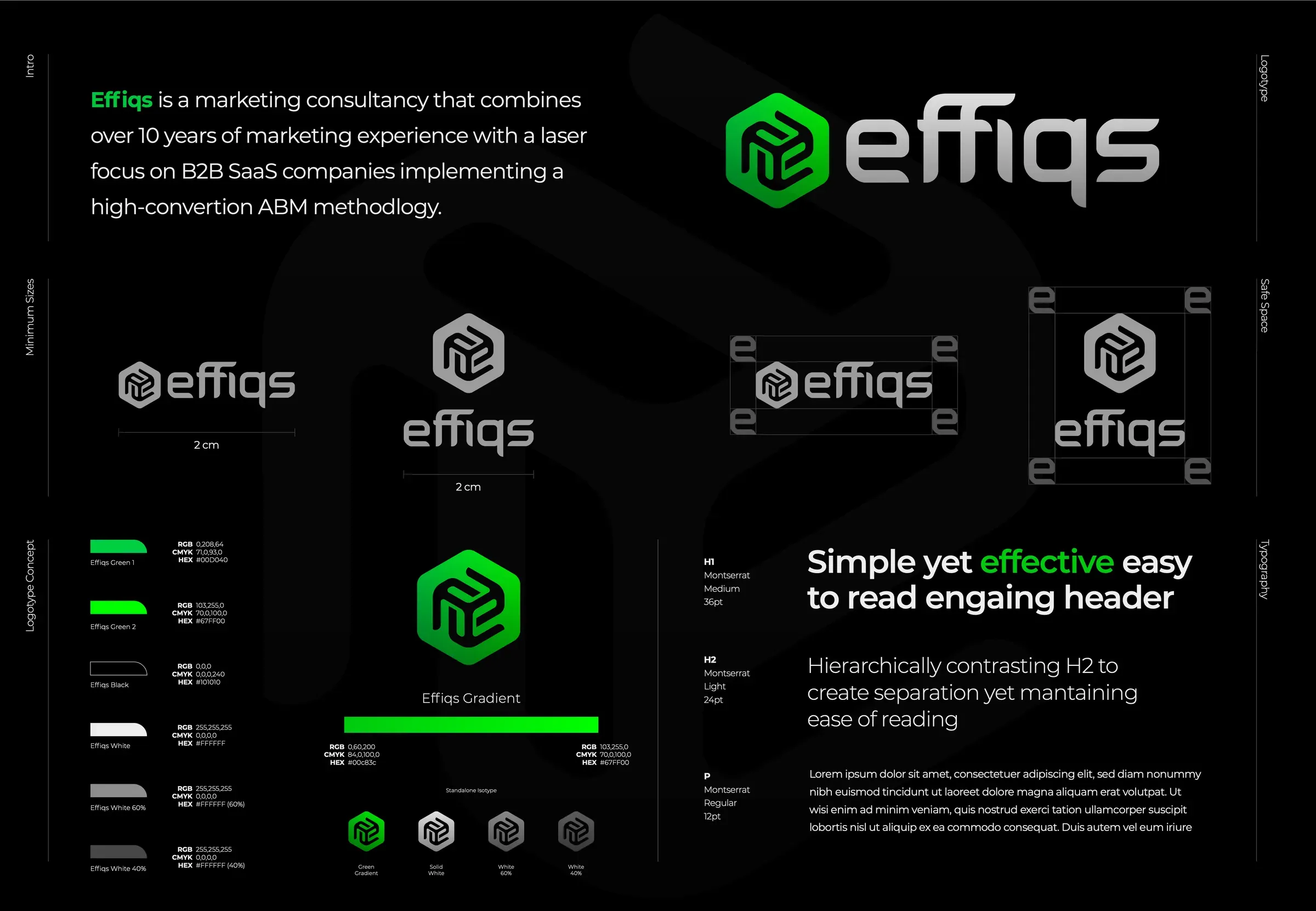
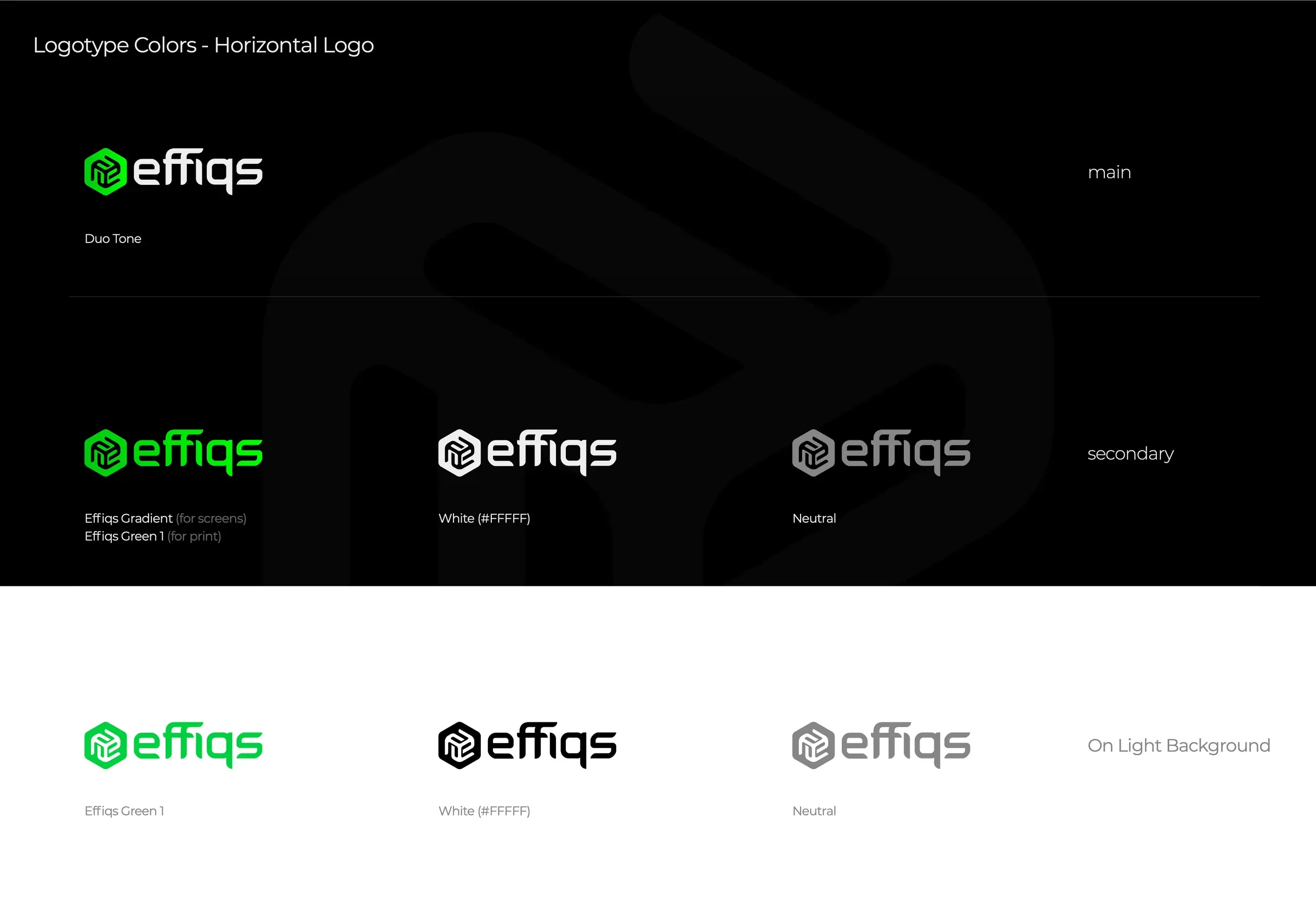
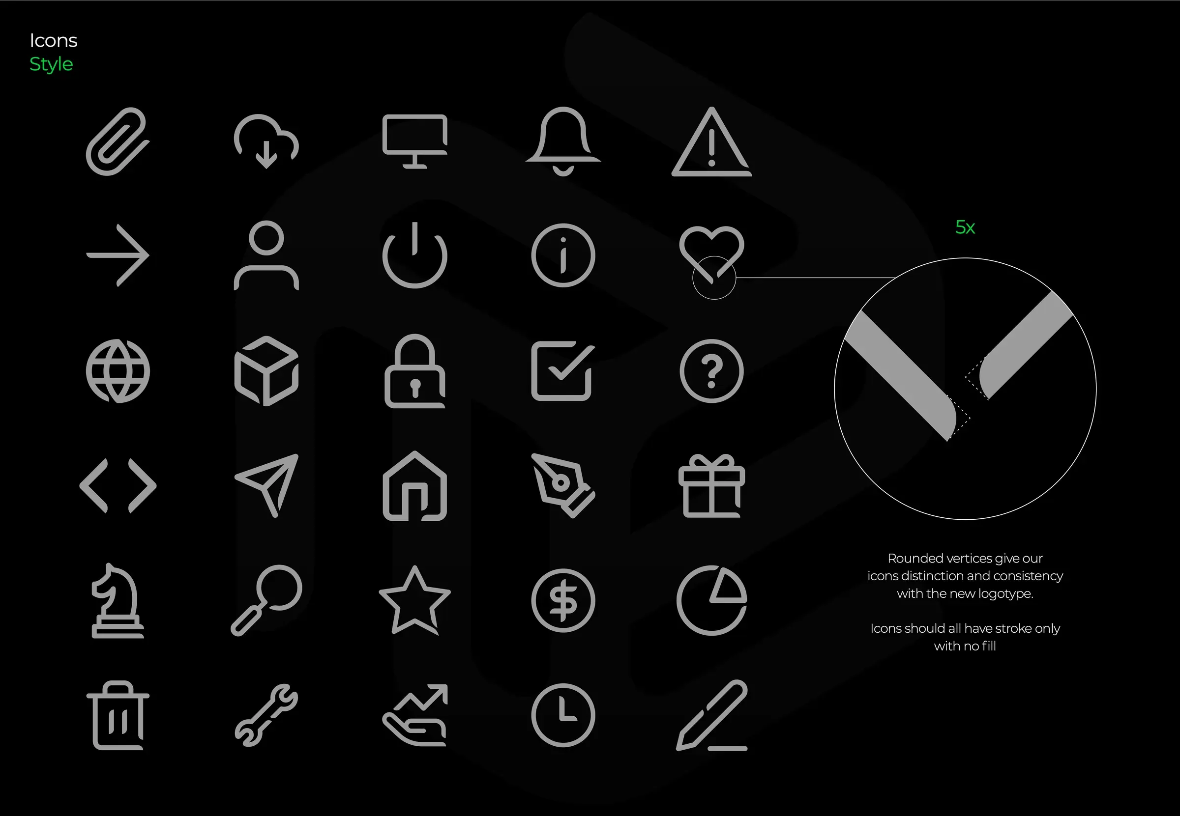
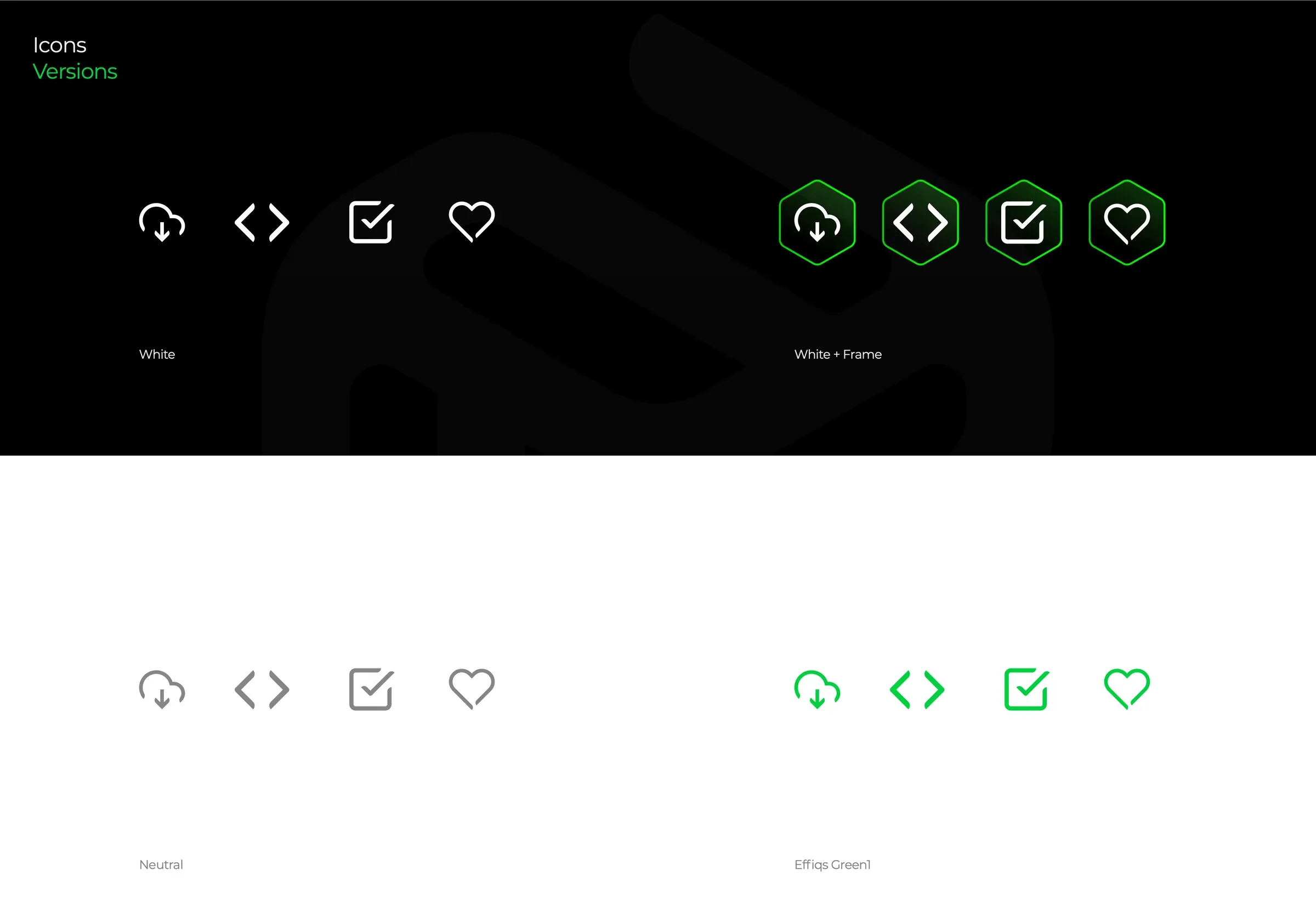
Color is a single gradient, #00C83C to #67FF00, running on #101010. Montserrat carries all the type. The personality behind it is the Magician archetype: innovative and efficient, with enough warmth to feel trustworthy and loyal. The same hex grid produced the icon set, so every pictogram shares the logo's DNA. From there the system rolled out to the website, which I designed and built, plus ad banners, stationery and sales templates.
05
Results
For the first time the brand matched the work in the portfolio. Sales calls stopped starting with an apology for the website, and the team finally had templates they were proud to send out.
Because I designed it and built it, nothing got simplified on the way to production. The gradient, the grid and the ligature on the live site are exactly what was approved in the guidelines.
3x
more inbound leads
in the 6 months after launch