One brand architecture for four schools and everything that comes next
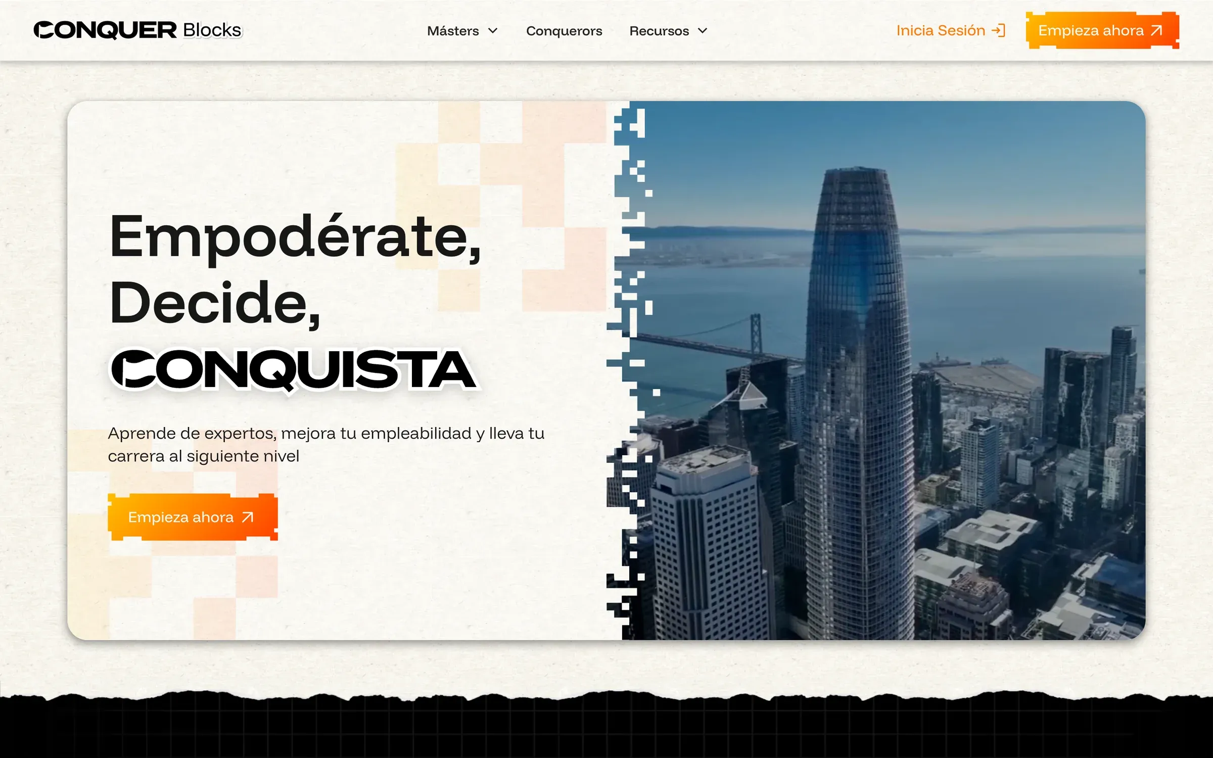
Conquer runs four online schools for Spanish speakers, and each one had grown its own look. I built a parent brand and a system of sub-brands, then designed and built the website and the student LMS.
4
business lines
under one parent brand
3
new initiatives
launched inside the system
120+
brand assets
delivered in the first quarter
35%
more course completions
after the new LMS
01
The client
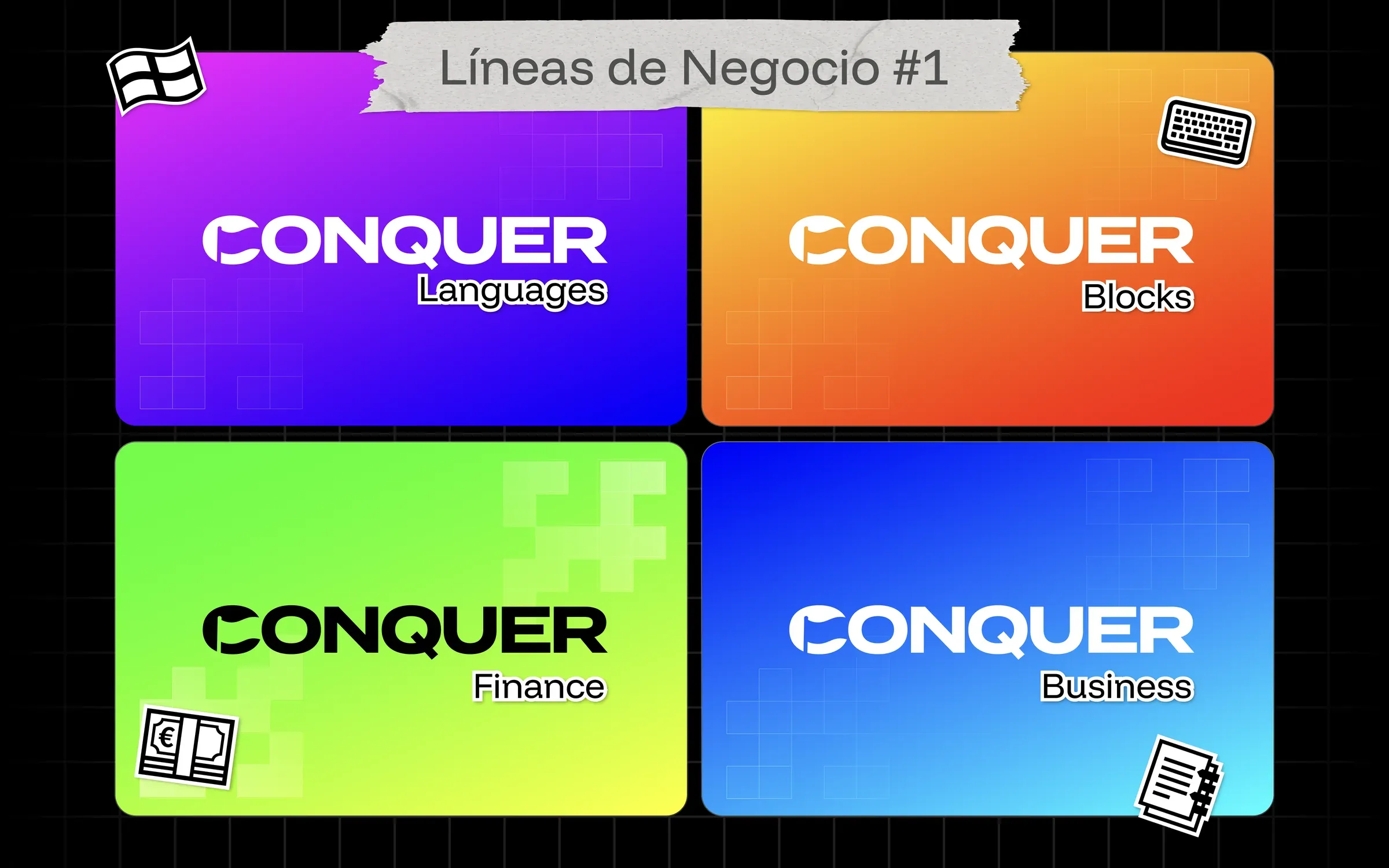
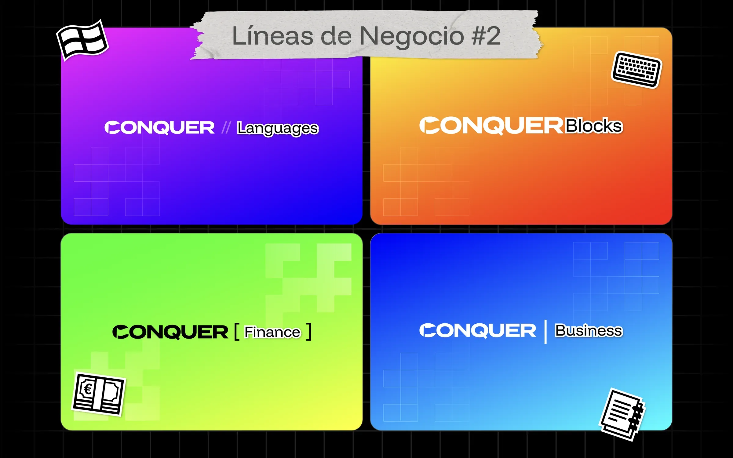
Conquer is an online education company for Spanish speakers. It runs four business lines: Conquer Languages, Conquer Blocks, Conquer Finance and Conquer Business. Each has its own students, teachers and sales team. I joined in 2026 to own brand and web across all of them.
02
The challenge
Every line had grown on its own, and it showed. Different logos, different colors, different tone. Students who took two programs felt like they were dealing with two companies. Leadership also had three new initiatives on the way and no system to hang them on. The job was to make Conquer feel like one company with several doors, while letting each line keep its own energy.
03
The process
We started with strategy, not logos. Brand architecture decisions are expensive to undo, so I wanted leadership aligned before anything visual existed.
- 01Strategy workshop. A working session with the founders on audience, promise and how the lines relate.
- 02Strategy document. Positioning, personality and the architecture model, written down and signed off.
- 03Moodboard and stylescapes. Three territories (Digital, Modern, Synthesis), iterated from v1 to v3.
- 04Logo sketches. Routes for a parent mark that could flex into each line.
- 05Brand architecture v1 to v3. The parent and four lines, refined over three versions, then the website and LMS.
01 / 07

Stylescape
02 / 07

Logo selected
03 / 07
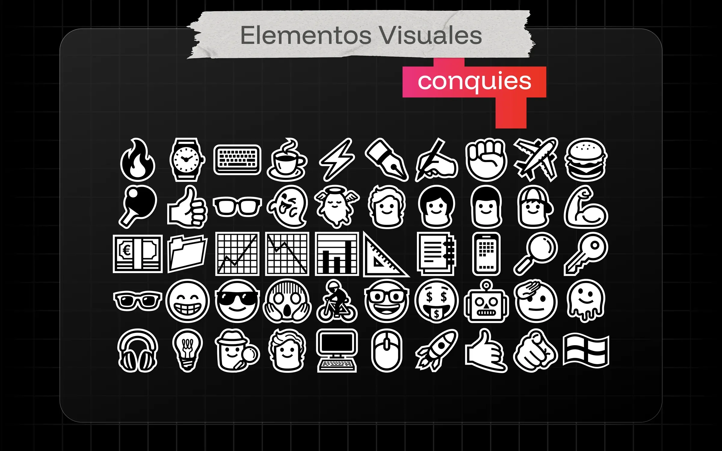
Iconography
04 / 07
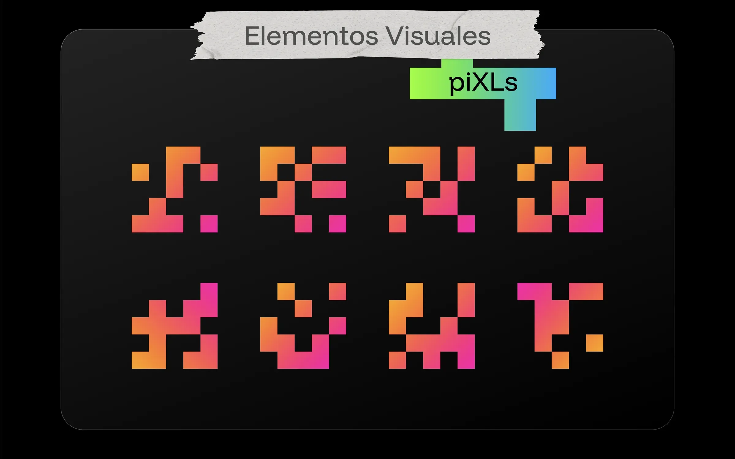
Pixel system
05 / 07
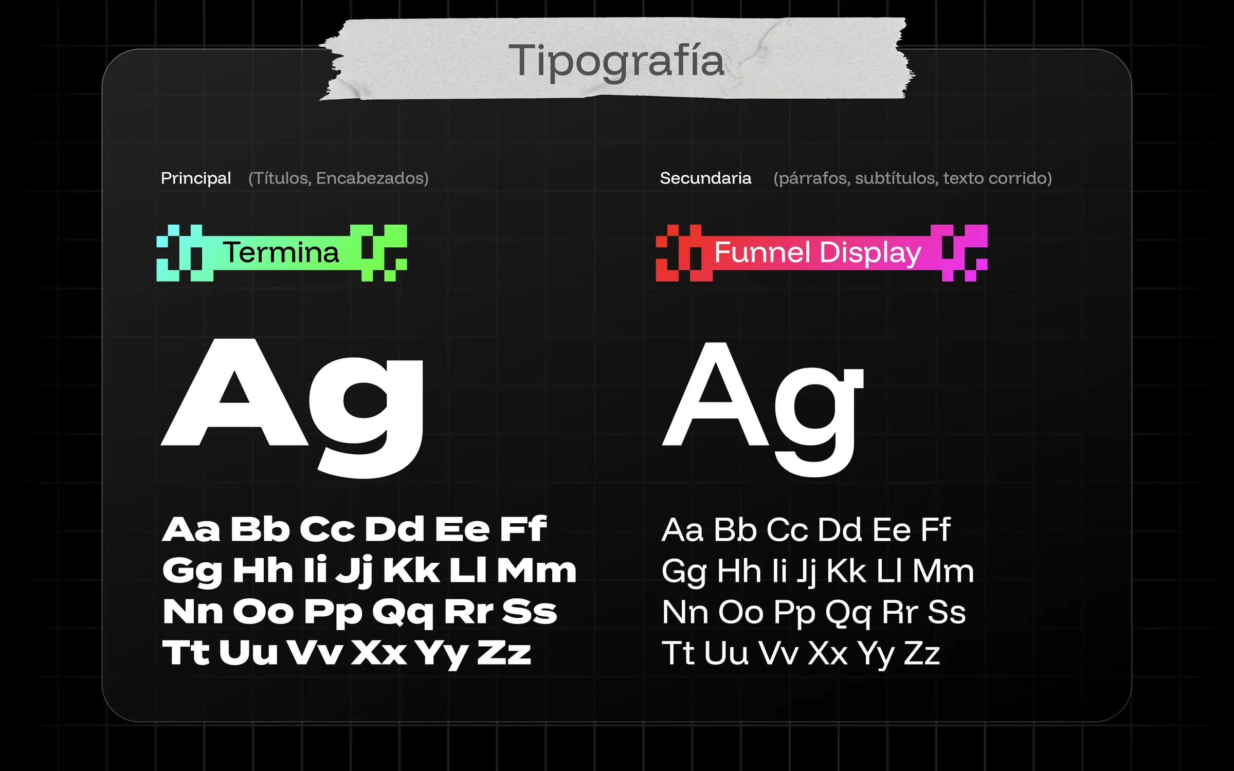
Typography
06 / 07
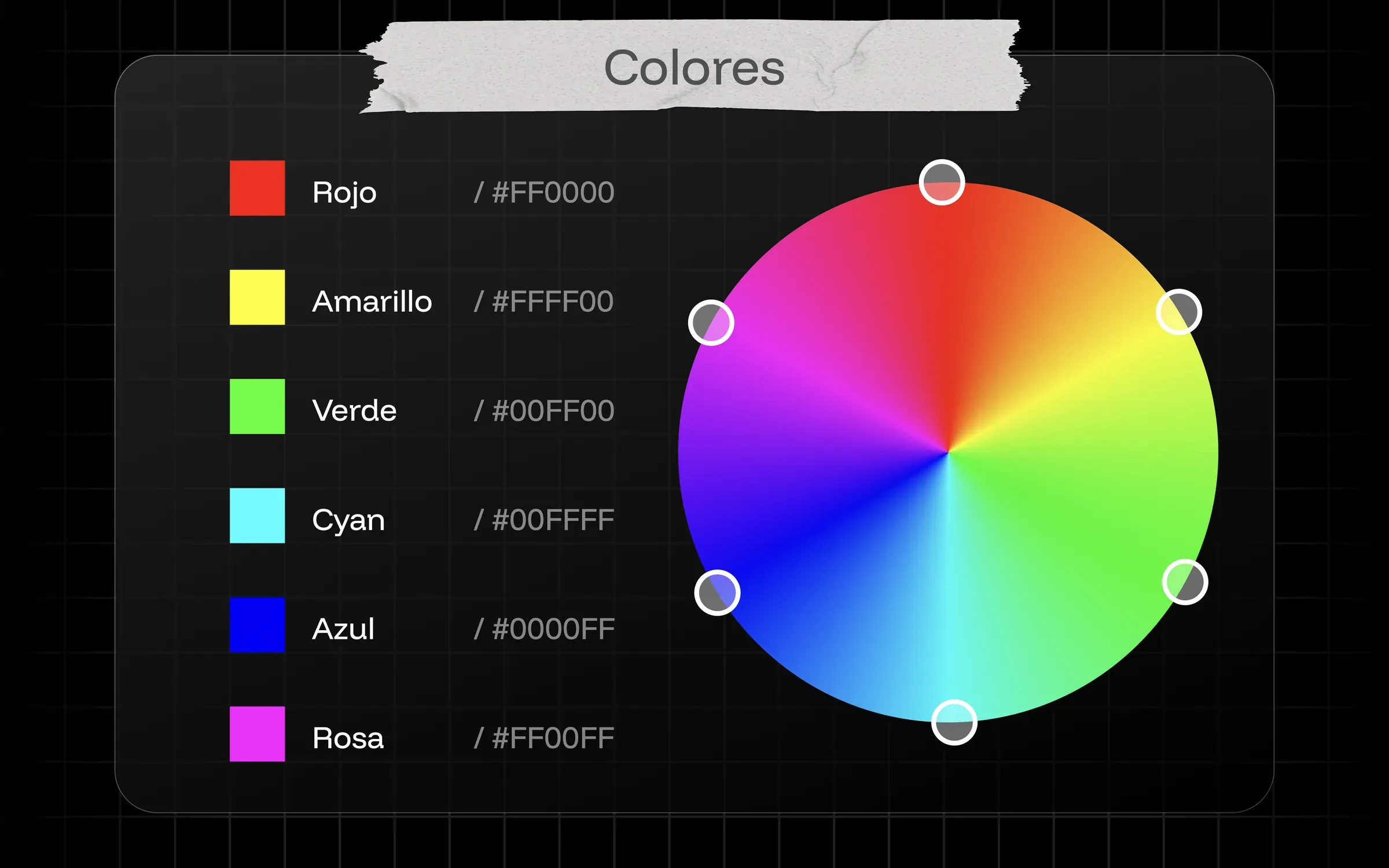
Color wheel
07 / 07
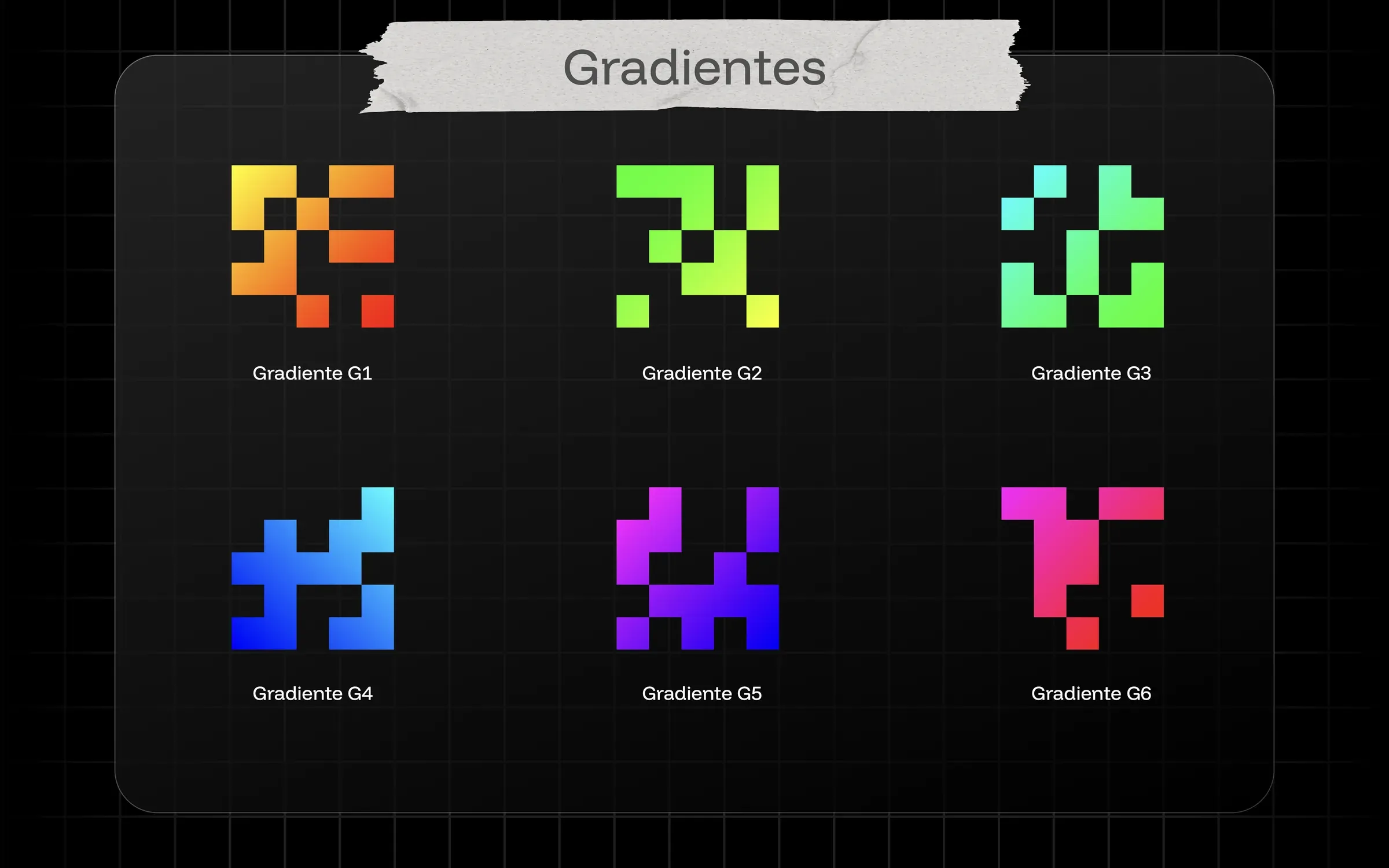
Gradients
04
The solution
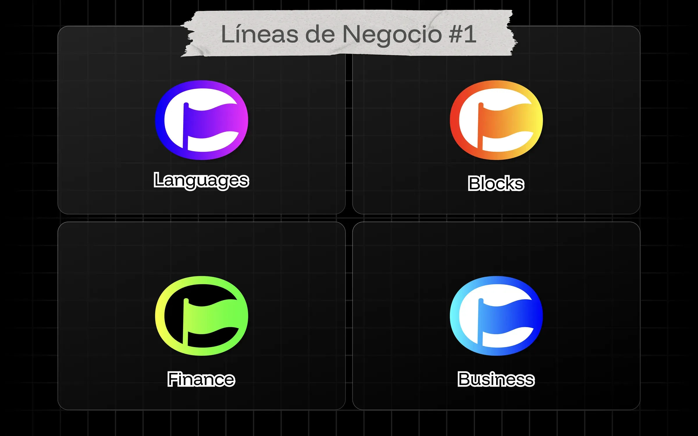
Everything sits on a black base. Pixel-art elements we call piXLs give the brand its texture, and each line gets its own flag isotype, so the family resemblance is obvious and the lines are still easy to tell apart.
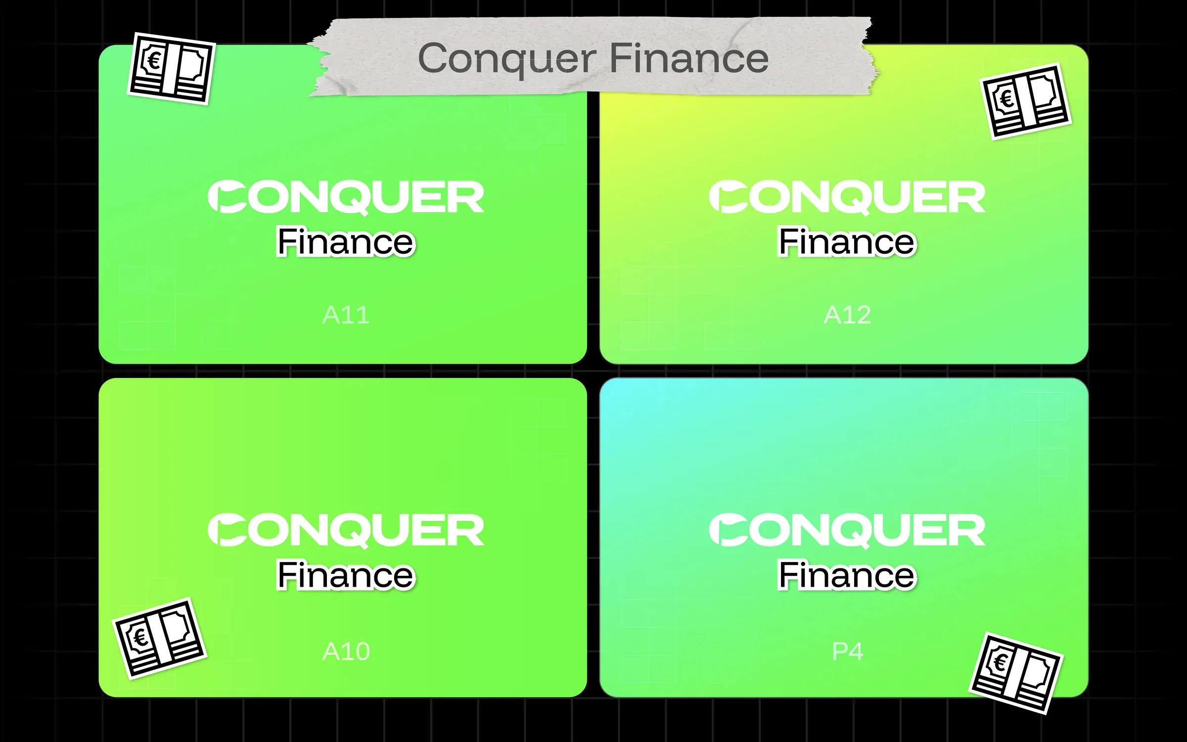
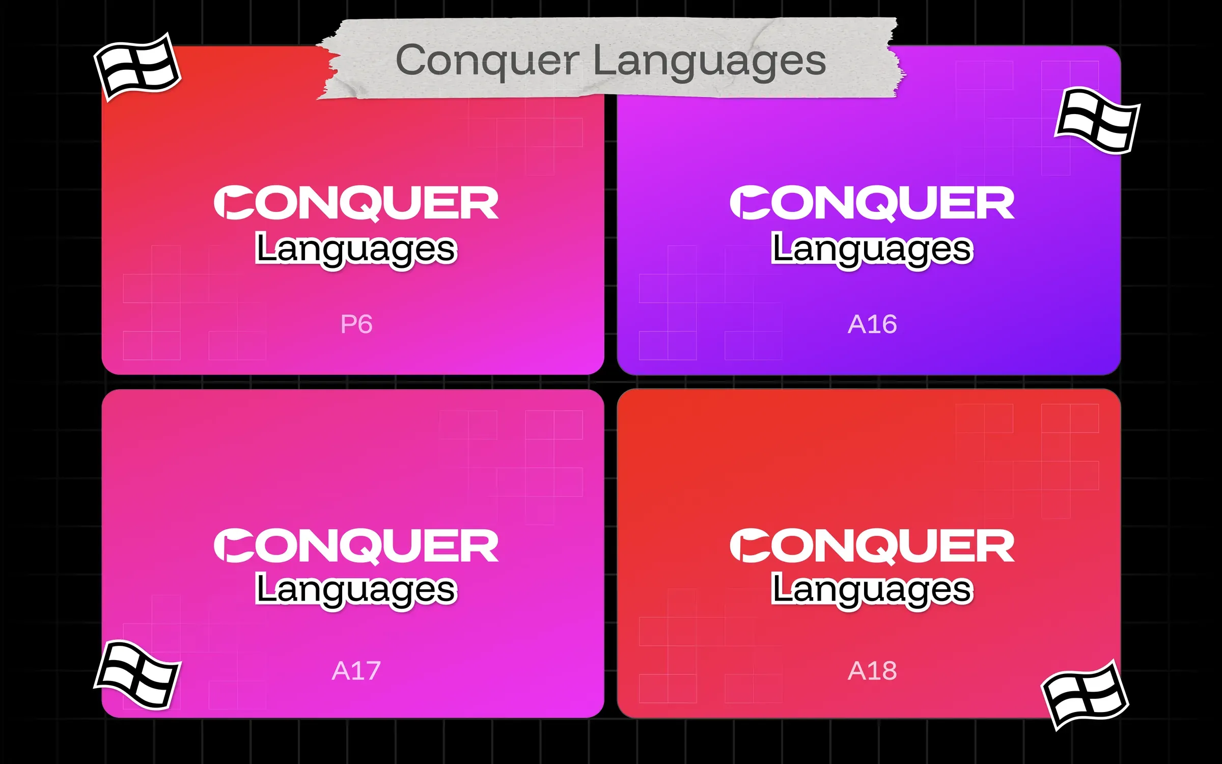
Color is a full-spectrum gradient system where each line owns a family: green to lime for Finance, magenta to pink and red for Languages, orange for Blocks, blue for Business. A paper texture warms up the digital look, "pixelación" transitions carry motion from one piece to the next, and photos sit inside pixel frames instead of floating loose. Termina sets the headlines and Funnel Display handles everything else.
I then designed and built the public website and the LMS students log into every day, so the brand holds from the first ad to the tenth lesson.
05
Results
New initiatives now launch in days instead of weeks, because the naming, color and layout decisions are already made. The sales teams work from one template library instead of four.
Students see the same brand on Instagram, on the website and inside the classroom. That consistency is hard to measure, but people notice when it's missing.
4
business lines
under one parent brand